Statistics and probability lesson5
9 likes9,421 views

The document discusses different methods for presenting data, including textual or narrative presentation, tabular presentation, and graphical presentation. It provides details on constructing frequency distribution tables, including identifying the range and number of classes, calculating class size, and tallying data. Frequency distribution tables show the distribution of data values and can include additional details like class marks, relative frequencies, and cumulative frequencies. Bar graphs are also discussed as a way to visually present the data in a frequency distribution table.


Statistics and probability lesson5
- 1. Lesson 5 – Data Presentation Ms. Maria Christita Polinag Miriam College Adult Education
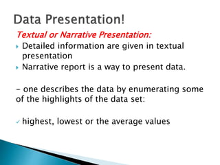
- 3. Textual or Narrative Presentation: Detailed information are given in textual presentation Narrative report is a way to present data. - one describes the data by enumerating some of the highlights of the data set: highest, lowest or the average values
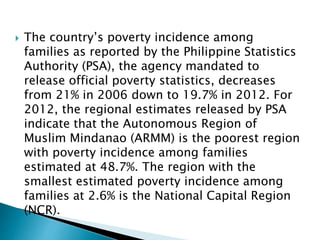
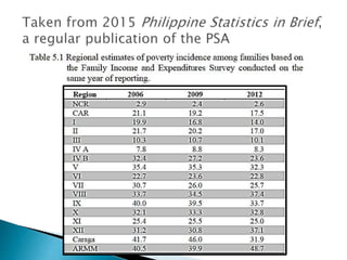
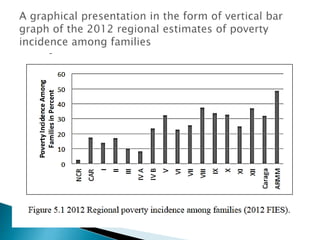
- 4. The country’s poverty incidence among families as reported by the Philippine Statistics Authority (PSA), the agency mandated to release official poverty statistics, decreases from 21% in 2006 down to 19.7% in 2012. For 2012, the regional estimates released by PSA indicate that the Autonomous Region of Muslim Mindanao (ARMM) is the poorest region with poverty incidence among families estimated at 48.7%. The region with the smallest estimated poverty incidence among families at 2.6% is the National Capital Region (NCR).
- 5. Tabular Presentation: Numerical values are presented using tables. Information are lost in tabular presentation of data. Frequency distribution table is also applicable for qualitative variables - applicable for large data sets - should have at least three rows and/or three columns
- 6. a. Table title includes the number and a short description of what is found inside the table. b. Column header provides the label of what is being presented in a column. c. Row header provides the label of what is being presented in a row. d. Body are the information in the cell intersecting the row and the column.
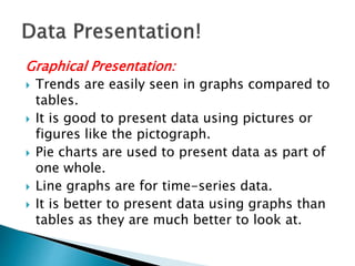
- 8. Graphical Presentation: Trends are easily seen in graphs compared to tables. It is good to present data using pictures or figures like the pictograph. Pie charts are used to present data as part of one whole. Line graphs are for time-series data. It is better to present data using graphs than tables as they are much better to look at.
- 9. - a visual presentation of the data - commonly used in oral presentation Several forms of graphs: a. Pie b. Chart c. Pictograph d. Bar graph - values of variables in nominal or ordinal levels e. Line graph - trends across time are easily seen f. Histogram g. Box-plot
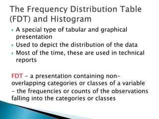
- 15. A special type of tabular and graphical presentation Used to depict the distribution of the data Most of the time, these are used in technical reports FDT - a presentation containing non- overlapping categories or classes of a variable - the frequencies or counts of the observations falling into the categories or classes
- 16. 1. Qualitative FDT - the non-overlapping categories of the variable are identified and frequencies - the percentages of observations falling into the categories are computed 2. Quantitative FDT - two types: ungrouped and grouped FDT
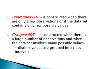
- 17. 1. Ungrouped FDT - is constructed when there are only a few observations or if the data set contains only few possible values 2. Grouped FDT - is constructed when there is a large number of observations and when the data set involves many possible values - distinct values are grouped into class intervals
- 18. 1. Identify the largest data value or the maximum (MAX) and smallest data value or the minimum (MIN) from the data set and compute the range, R. The range is the difference between the largest and smallest value, i.e. R = MAX – MIN.
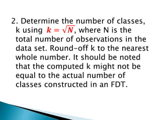
- 19. 2. Determine the number of classes, k using , where N is the total number of observations in the data set. Round-off k to the nearest whole number. It should be noted that the computed k might not be equal to the actual number of classes constructed in an FDT.
- 20. 3. Calculate the class size, c, using c = R/k. Round off c to the nearest value with precision the same as that with the raw data.
- 21. 4. Construct the classes or the class intervals. A class interval is defined by a lower limit (LL) and an upper limit (UL). The LL of the lowest class is usually the MIN of the data set. The LL’s of the succeeding classes are then obtained by adding c to the LL of the preceding classes. The UL of the lowest class is obtained by subtracting one unit of measure , where x is the maximum number of decimal places observed from the raw data) from the LL of the next class. The UL’s of the succeeding classes are then obtained by adding c to the UL of the preceding classes. The lowest class should contain the MIN, while the highest class should contain the MAX.
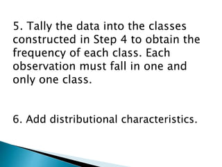
- 22. 5. Tally the data into the classes constructed in Step 4 to obtain the frequency of each class. Each observation must fall in one and only one class. 6. Add distributional characteristics.
- 23. a. True Class Boundaries (TCB). The TCBs reflect the continuous property of a continuous data. It is defined by a lower TCB (LTCB) and an upper TCB (UTCB). These are obtained by taking the midpoints of the gaps between classes or by using the following formulas: LTCB = LL – 0.5(one unit of measure) and UTCB = UL + 0.5(one unit of measure).
- 24. b. Class Mark (CM). The CM is the midpoint of a class and is obtained by taking the average of the lower and upper TCB’s, i.e. CM = (LTCB + UTCB)/2
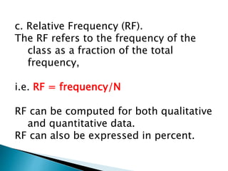
- 25. c. Relative Frequency (RF). The RF refers to the frequency of the class as a fraction of the total frequency, i.e. RF = frequency/N RF can be computed for both qualitative and quantitative data. RF can also be expressed in percent.
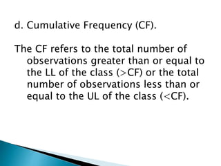
- 26. d. Cumulative Frequency (CF). The CF refers to the total number of observations greater than or equal to the LL of the class (>CF) or the total number of observations less than or equal to the UL of the class (<CF).
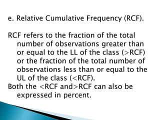
- 27. e. Relative Cumulative Frequency (RCF). RCF refers to the fraction of the total number of observations greater than or equal to the LL of the class (>RCF) or the fraction of the total number of observations less than or equal to the UL of the class (<RCF). Both the <RCF and>RCF can also be expressed in percent.
- 28. - is a graphical presentation of the frequency distribution table in the form of a vertical bar graph. frequency - vertical axis true class boundaries - horizontal axis.
- 32. TEACHING GUIDE FOR SENIOR HIGH SCHOOL - Statistics and Probability by CHED in collaboration with the Philippine Normal University