Descriptive statistics
Download as PPTX, PDF10 likes5,232 views

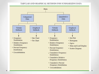
This document provides an overview of descriptive statistics techniques for summarizing categorical and quantitative data. It discusses frequency distributions, measures of central tendency (mean, median, mode), measures of variability (range, variance, standard deviation), and methods for visualizing data through charts, graphs, and other displays. The goal of descriptive statistics is to organize and describe the characteristics of data through counts, averages, and other summaries.


![• For the class size data, we found a sample mean of 44 and a sample
standard deviation of 8. The coefficient of variation is [(8/44)X100]%
=18.2%. In words, the coefficient of variation tells us that the sample
standard deviation is 18.2% of the value of the sample mean.](https://izqule7twkl7vq3ljkxejyz-s-a2157.bj.tsgdht.cn/descriptivestatistics-150328173350-conversion-gate01/85/Descriptive-statistics-31-320.jpg)


Descriptive statistics
- 1. Descriptive Statistics By:- Anand Thokal Bhanu Chander Reddy E. Ananta Krishna
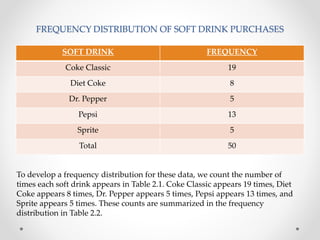
- 2. 1. Summarizing Categorical Data • FREQUENCY DISTRIBUTION:- A frequency distribution is a tabular summary of data showing the number (frequency) of items in each of several non overlapping classes. • Coke Classic, Diet Coke, Dr. Pepper, Pepsi, and Sprite are five popular soft drinks. Assume that the data in Table 2.1 show the soft drink selected in a sample of 50 soft drink purchases.
- 3. FREQUENCY DISTRIBUTION OF SOFT DRINK PURCHASES SOFT DRINK FREQUENCY Coke Classic 19 Diet Coke 8 Dr. Pepper 5 Pepsi 13 Sprite 5 Total 50 To develop a frequency distribution for these data, we count the number of times each soft drink appears in Table 2.1. Coke Classic appears 19 times, Diet Coke appears 8 times, Dr. Pepper appears 5 times, Pepsi appears 13 times, and Sprite appears 5 times. These counts are summarized in the frequency distribution in Table 2.2.
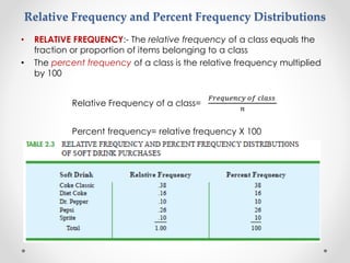
- 4. Relative Frequency and Percent Frequency Distributions • RELATIVE FREQUENCY:- The relative frequency of a class equals the fraction or proportion of items belonging to a class • The percent frequency of a class is the relative frequency multiplied by 100 Relative Frequency of a class= 𝐹𝑟𝑒𝑞𝑢𝑒𝑛𝑐𝑦 𝑜𝑓 𝑐𝑙𝑎𝑠𝑠 𝑛 Percent frequency= relative frequency X 100
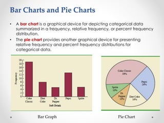
- 5. Bar Charts and Pie Charts • A bar chart is a graphical device for depicting categorical data summarized in a frequency, relative frequency, or percent frequency distribution. • The pie chart provides another graphical device for presenting relative frequency and percent frequency distributions for categorical data. Bar Graph Pie Chart
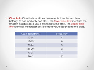
- 6. 2. Summarizing Quantitative Data • Frequency Distribution’s definition holds for quantitative as well as categorical data. However, with quantitative data we must be more careful in defining the non overlapping classes to be used in the frequency distribution • For example, consider the quantitative data in Table 2.4. These data show the time in days required to complete year-end audits for a sample of 20 clients of Sanderson and Clifford, a small public accounting firm. The three steps necessary to define the classes for a frequency distribution with quantitative data are 1. Determine the number of non overlapping classes. 2. Determine the width of each class. 3. Determine the class limits. (2.4) Year-end audit time in days 12 14 19 18 15 15 18 17 20 27 22 23 22 21 33 28 14 18 16 13
- 7. • Class limits Class limits must be chosen so that each data item belongs to one and only one class. The lower class limit identifies the smallest possible data value assigned to the class. The upper class limit identifies the largest possible data value assigned to the class. Audit Time(Days) Frequency 10–14 4 15–19 8 20–24 5 25–29 2 30–34 1 Total 20
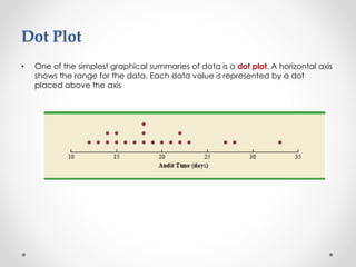
- 8. Dot Plot • One of the simplest graphical summaries of data is a dot plot. A horizontal axis shows the range for the data. Each data value is represented by a dot placed above the axis
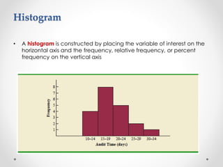
- 9. • A histogram is constructed by placing the variable of interest on the horizontal axis and the frequency, relative frequency, or percent frequency on the vertical axis Histogram
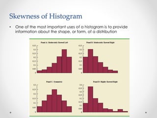
- 10. Skewness of Histogram • One of the most important uses of a histogram is to provide information about the shape, or form, of a distribution
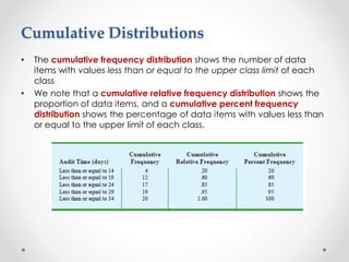
- 11. Cumulative Distributions • The cumulative frequency distribution shows the number of data items with values less than or equal to the upper class limit of each class • We note that a cumulative relative frequency distribution shows the proportion of data items, and a cumulative percent frequency distribution shows the percentage of data items with values less than or equal to the upper limit of each class.
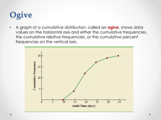
- 12. Ogive • A graph of a cumulative distribution, called an ogive, shows data values on the horizontal axis and either the cumulative frequencies, the cumulative relative frequencies, or the cumulative percent frequencies on the vertical axis.
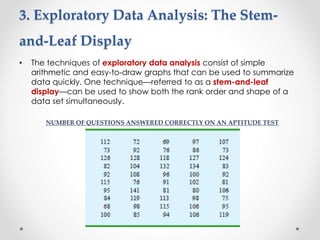
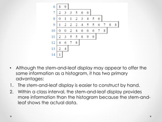
- 13. 3. Exploratory Data Analysis: The Stem- and-Leaf Display • The techniques of exploratory data analysis consist of simple arithmetic and easy-to-draw graphs that can be used to summarize data quickly. One technique—referred to as a stem-and-leaf display—can be used to show both the rank order and shape of a data set simultaneously. NUMBER OF QUESTIONS ANSWERED CORRECTLY ON AN APTITUDE TEST
- 14. • Although the stem-and-leaf display may appear to offer the same information as a histogram, it has two primary advantages: 1. The stem-and-leaf display is easier to construct by hand. 2. Within a class interval, the stem-and-leaf display provides more information than the histogram because the stem-and- leaf shows the actual data.
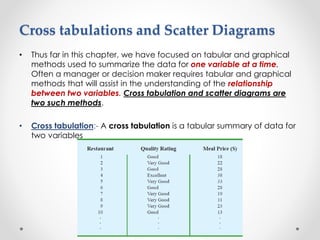
- 15. Cross tabulations and Scatter Diagrams • Thus far in this chapter, we have focused on tabular and graphical methods used to summarize the data for one variable at a time. Often a manager or decision maker requires tabular and graphical methods that will assist in the understanding of the relationship between two variables. Cross tabulation and scatter diagrams are two such methods. • Cross tabulation:- A cross tabulation is a tabular summary of data for two variables
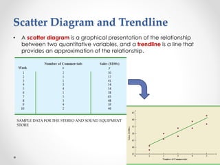
- 17. Scatter Diagram and Trendline • A scatter diagram is a graphical presentation of the relationship between two quantitative variables, and a trendline is a line that provides an approximation of the relationship. SAMPLE DATA FOR THE STEREO AND SOUND EQUIPMENT STORE
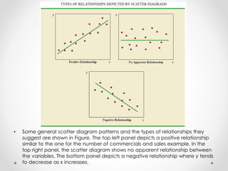
- 18. • Some general scatter diagram patterns and the types of relationships they suggest are shown in Figure. The top left panel depicts a positive relationship similar to the one for the number of commercials and sales example. In the top right panel, the scatter diagram shows no apparent relationship between the variables. The bottom panel depicts a negative relationship where y tends to decrease as x increases.
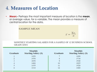
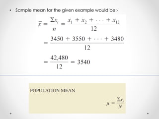
- 21. 4. Measures of Location • Mean:- Perhaps the most important measure of location is the mean, or average value, for a variable. The mean provides a measure of central location for the data.
- 22. • Sample mean for the given example would be:-
- 23. • Median:- The median is another measure of central location. The median is the value in the middle when the data are arranged in ascending order (smallest value to largest value). • With an odd number of observations, the median is the middle value. • An even number of observations has no single middle value so in this case, we take average of the values for the middle two observations.
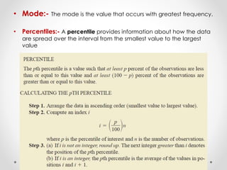
- 24. • Mode:- The mode is the value that occurs with greatest frequency. • Percentiles:- A percentile provides information about how the data are spread over the interval from the smallest value to the largest value
- 25. Quartiles • Quartiles are just specific percentiles; thus, the steps for computing percentiles can be applied directly in the computation of quartiles.
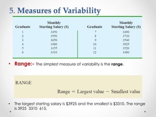
- 26. 5. Measures of Variability • Range:- The simplest measure of variability is the range. • The largest starting salary is $3925 and the smallest is $3310. The range is 3925 3310 615.
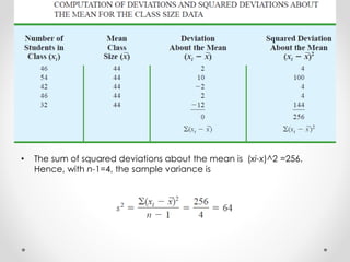
- 27. • Interquartile Range:-A measure of variability that overcomes the dependency on extreme values is the interquartile range (IQR). • Variance:- The variance is a measure of variability that utilizes all the data. • The difference between each xi and the mean ( for a sample, μ for a population) is called a deviation about the mean. • If the data are for a population, the average of the squared deviations is called the population variance.
- 28. • Although a detailed explanation is beyond the scope of this text, it can be shown that if the sum of the squared deviations about the sample mean is divided by n-1, and not n, the resulting sample variance provides an unbiased estimate of the population variance.
- 29. • The sum of squared deviations about the mean is (xi-x)^2 =256. Hence, with n-1=4, the sample variance is
- 30. • Standard Deviation:- The standard deviation is defined to be the positive square root of the variance. • Hence the Sample Standard Deviation=8, for the latest example • Coefficient of Variation:- In some situations we may be interested in a descriptive statistic that indicates how large the standard deviation is relative to the mean. This measure is called the coefficient of variation and is usually expressed as a percentage.
- 31. • For the class size data, we found a sample mean of 44 and a sample standard deviation of 8. The coefficient of variation is [(8/44)X100]% =18.2%. In words, the coefficient of variation tells us that the sample standard deviation is 18.2% of the value of the sample mean.
- 32. 6. Measures of Distribution Shape, Relative Location, and Detection of Outliers • Distribution Shape For a symmetric distribution, the mean and the median are equal.
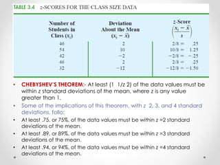
- 33. • z-Scores:- In addition to measures of location, variability, and shape, we are also interested in the relative location of values within a data set. • Measures of relative location help us determine how far a particular value is from the mean. • By using both the mean and standard deviation, we can determine the relative location of any observation. • The z-score is often called the standardized value. The z-score, zi, can be interpreted as the number of standard deviations xi is from the mean . For example, z1=1.2 would indicate that x1 is1.2 standard deviations greater than the sample mean.
- 34. • CHEBYSHEV’S THEOREM:- At least (1 1/z 2) of the data values must be within z standard deviations of the mean, where z is any value greater than 1. • Some of the implications of this theorem, with z 2, 3, and 4 standard deviations, follo: • At least .75, or 75%, of the data values must be within z =2 standard deviations of the mean. • At least .89, or 89%, of the data values must be within z =3 standard deviations of the mean. • At least .94, or 94%, of the data values must be within z =4 standard deviations of the mean.
- 35. • For an example using Chebyshev’s theorem, suppose that the midterm test scores for 100 students in a college business statistics course had a mean of 70 and a standard deviation of 5. How many students had test scores between 60 and 80? • For the test scores between 60 and 80, • We note that 60 is two standard deviations below the mean and 80 is two standard deviations above the mean. • Using Chebyshev’s theorem, we see that at least .75, or at least 75%, of the observations must have values within two standard deviations of the mean. • Thus, at least 75% of the students must have scored between 60 and 80.
- 36. • Outliers:- Sometimes a data set will have one or more observations with unusually large or unusually small values. These extreme values are called outliers.
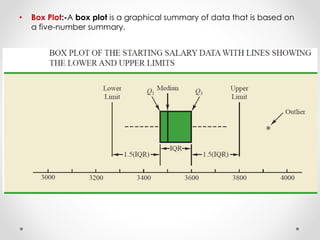
- 37. 7. Exploratory Data Analysis • Five-Number Summary:- In a five-number summary, the following five numbers are used to summarize the data: 1. Smallest value 2. First quartile (Q1) 3. Median (Q2) 4. Third quartile (Q3) 5. Largest value • The easiest way to develop a five-number summary is to first place the data in ascending order. Then it is easy to identify the smallest value, the three quartiles, and the largest value.
- 38. • Box Plot:-A box plot is a graphical summary of data that is based on a five-number summary.
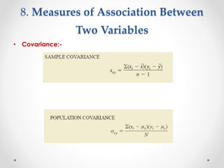
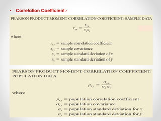
- 39. 8. Measures of Association Between Two Variables • Covariance:-
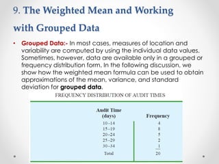
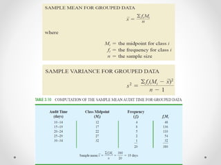
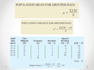
- 42. 9. The Weighted Mean and Working with Grouped Data • Grouped Data:- In most cases, measures of location and variability are computed by using the individual data values. Sometimes, however, data are available only in a grouped or frequency distribution form. In the following discussion, we show how the weighted mean formula can be used to obtain approximations of the mean, variance, and standard deviation for grouped data.
- 45. Thank You…