SlideShare a Scribd company logo
Statistics
Dr. Nagarajan Srinivasan,
CEO and Director (Research)
CGN Research World
MEANING OF DESCRIPTIVE STATISTICS
The word statistics has different meaning to different persons. For
some, it is a one number description of a set of data. Some consider
statistics in terms of numbers used as measurements or counts.
Mathematicians use statistics to describe data in one word. It is a
summary of an event for them. Number , n, is the statistic
describing how big the set of numbers is, how many pieces of data
are in the set.
Also, knowledge of statistics is applicable in day to day life in
different ways. Statistics is used by people to take decision about
the problems on the basis of different types of information available
to them. However, in behavioral sciences the word ‘statistics’
means something different, that is its prime function is to draw
statistical inference about population on the basis of available
quantitative and qualitative information.
OBJECTIVESAftergoingthrough
thisunit,youwillbeableto:
definethenatureandmeaningof
descriptivestatistics;
describethemethodsoforganising
andcondensingrawdata;
explainconceptandmeaningof
differentmeasuresofcentral
tendency;
analysethemeaningofdifferent
measuresofdispersion;zdefine
inferentialstatistics;
explaintheconceptofestimation;
distinguishbetweenpoint
estimationandintervalestimation;
and
explainthedifferent concepts
involvedinhypothesistesting.
 The word statistics can be defined in two different ways. In
singular sense ‘Statistics’ refers to what is called statistical
methods. When ‘Statistics’ is used in plural sense it refers to
‘data’.
 The term ‘statistics’ in singular sense. In this context, it is
described as a branch of science which deals with the collection of
data, their classification, analysis and interpretations of statistical
data. The science of statistics may be broadly studied under two
headings:
i) Descriptive Statistics, and (ii) Inferential Statistics
 Descriptive Statistics:
Most of the observations in this universe are subject to variability,
especially observations related to human behavior. It is a well
known fact that attitude, intelligence and personality differ from
individual to individual. In order to make a sensible definition of the
group or to identify the group with reference to their observations/
scores, it is necessary to express them in a precise manner. For this
purpose observations need to be expressed as a single estimate
which summarizes the observations.
 Descriptive statistics is a branch of statistics, which deals with
descriptions of obtained data.
 On the basis of these descriptions a particular group of population
is defined for corresponding characteristics.
 The descriptive statistics include classification, tabulation,
diagrammatic and graphical presentation of data, measures of
central tendency and variability.
 These measures enable the researchers to know about the
tendency of data or the scores, which further enhance the ease in
description of the phenomena.
 Such single estimate of the series of data which summarizes the
distribution are known as parameters of the distribution.
 These parameters define the distribution completely.
 Basically descriptive statistics involves two operations:
(i) Organization of data, and (ii) Summarization of data
ORGANISATIONOF DATA
There are four major statistical techniques for organizing the data.
These are:
i) Classification
ii) Tabulation
iii) Graphical Presentation, and
iv) Diagrammatical Presentation
Classification
The arrangement of data in groups according to similarities is
known as classification.
A classification is a summary of the frequency of individual scores or
ranges of scores for a variable.
In the simplest form of a distribution, we will have such value of
variable as well as the number of persons who have had each value.
Once data are collected, it should be arranged in a format from
which they would be able to draw some conclusions.
Thus by classifying data, the investigators move a step ahead in
regard to making a decision.
A much clear picture of the information of score emerges when the
raw data are organized as a frequency distribution.
Frequency distribution shows the number of cases following within
a given class interval or range of scores.
A frequency distribution is a table that shows each score as obtained
by a group of individuals and how frequently each score occurred.
Frequency Distribution can be with Ungrouped Data and Grouped
Data
i) An ungrouped frequency distribution may be constructed by
listing all score values either from highest to lowest or lowest
to highest and placing a tally mark (/) besides each scores every
times it occurs. The frequency of occurrence of each score is
denoted by ‘f’.
ii) Grouped frequency distribution: If there is a wide range of
score value in the data, then it is difficult to get a clear picture
of such series of data. In this case grouped frequency
distribution should be constructed to have a clear picture of the
data. A group frequency distribution is a table that organizes
data into classes.
It shows the number of observations from the data set that fall into
each of the class.
Construction of frequency distribution
To prepare a frequency distribution it is essential to determine the
following:
1) The range of the given data =, the difference between the
highest and lowest scores.
2) The number of class intervals = There is no hard and fast rules
regarding the number of classes into which data should be
grouped.
If there are very few scores it is useless to have a large number
of class-intervals.Ordinarily, the number of classes should be
between 5 to 30.
1) Limits of each class interval = Another factor used in
determining the number of classes is the size/ width or range of
the class which is known as ‘class interval’ and is denoted by ‘i’.
Class interval should be of uniform width resulting in the same-size
classes of frequency distribution. The width of the class should be a
whole number and conveniently divisible by 2, 3, 5, 10, or 20.
There are three methods for describing the class limits for
distribution:
(i) Exclusive method,
(ii) Inclusive method and
(iii) True or actual class method.
Exclusive method
1. In this method of class formation, the classes are so formed that
the upper limit of one class become the lower limit of the next class.
In this classification, it is presumed that score equal to the upper
limit of the class is exclusive, i.e., a score of 40 will be included in the
class of 40 to 50 and not in a class of 30 to 40 (30-40, 40-50, 50-60)
2. Inclusive method In this method the classes are so formed that
the upper limit of one class does not become the lower limit of the
next class. This classification includes scores, which are equal to the
upper limit of the class.
Inclusive method is preferred when measurements are given in
whole numbers. (30-39, 40-49, 50-59)
3. True or Actual class method Mathematically, a score is an internal
when it extends from 0.5 units below to 0.5 units above the face
value of the score on a continuum. These class limits are known as
true or actual class limits. (29.5 to 39.5, 39.5 to 49.5) etc.
Types of Frequency Distribution
There are various ways to arrange frequencies of a data array based on
the requirement of the statistical analysis or the study.
A couple of them are discussed below:
i) Relative frequency distribution:A relative frequency distribution is
a distribution that indicates the proportion of the total number of
cases observed at each score value or internal of score values.
ii) Cumulative frequency distribution: Sometimes investigator may
be interested to know the number of observations less than a
particular value.
iii) This is possible by computing the cumulative frequency. A
cumulative frequency corresponding to a class-interval is the sum
of frequencies for that class and of all classes prior to that class. iii)
Cumulative relative frequency distribution:A cumulative relative
frequency distribution is one in which the entry of any score of
class interval expresses that score’s cumulative frequency as a
proportion of the total number of cases.
Tabulation
Frequency distribution can be either in the form of a table or it can
be in the form of graph.
Tabulation is the process of presenting the classified data in the
form of a table. A tabular presentation of data becomes more
intelligible and fit for further statistical analysis.
A table is a systematic arrangement of classified data in row and
columns with appropriate headings and sub-headings.
The main components of a table are:
i) Table number: When there is more than one table in a particular
analysis a table should be marked with a number for their reference
and identification. The number should be written in the center at
the top of the table.
Title of the table: Every table should have an appropriate title,
which describes the content of the table.
The title should be clear, brief, and self-explanatory.
Title of the table should be placed either centrally on the top of the
table or just below or after the table number.
iii) Caption: Captions are brief and self-explanatory headings for
columns. Captions may involve headings and sub-headings. The
captions should be placed in the middle of the columns.
For example, we can divide students of a class into males and
females, rural and urban, high SES and Low SES etc.
iv) Stub: Stubs stand for brief and self-explanatory headings for
rows.
v) Body of the table: This is the real table and contains numerical
information or data in different cells.
This arrangement of data remains according to the description of
captions and stubs.
vi) Head note: This is written at the extreme right hand below the
title and explains the unit of the measurements used in the body of
the tables.
vii) Footnote: This is a qualifying statement which is to be written
below the table explaining certain points related to the data which
have not been covered in title, caption, and stubs.
viii) Source of data: The source from which data have been taken is
to be mentioned at the end of the table.
Title
Stub Head
Stub Entries
Caption
Column Head I Column Head II
Sub Head Sub Head Sub Head Sub Head
Main Body of the Table
Total
Foot Note(s):
Source
Graphical Presentation of Data
The purpose of preparing a frequency distribution is to provide a
systematic way of “ looking at” and understanding data.
To extend this understanding, the information contained in a
frequency distribution often is displayed in graphic and/or
diagrammatic forms.
In graphical presentation of frequency distribution, frequencies are
plotted on a pictorial platform formed of horizontal and vertical
lines known as graph.
A graph is created on two mutually perpendicular lines called the X
andY–axes on which appropriate scales are indicated.
The horizontal line is called the abscissa and vertical the ordinate.
Like different kinds of frequency distributions there are many kinds
of graph too, which enhance the scientific understanding of the
reader.
The commonly used graphs are Histogram, Frequency polygon,
Frequency curve, Cumulative frequency curve.
Here we will discuss some of the important types of graphical
patterns used in statistics.
i) Histogram: It is one of the most popular methods for
presenting continuous frequency distribution in a form of
graph. In this type of distribution the upper limit of a class is
the lower limit of the following class. The histogram consists of
series of rectangles, with its width equal to the class interval of
the variable on horizontal axis and the corresponding
frequency on the vertical axis as its heights.
ii) Frequency polygon: Prepare an abscissa originating from ‘O’
and ending to ‘X’. Again construct the ordinate starting from
‘O’ and ending at ‘Y’. Now label the class-intervals on abscissa
stating the exact limits or midpoints of the class intervals. You
can also add one extra limit keeping zero frequency on both
side of the class-interval range.
The size of measurement of small squares on graph paper depends
upon the number of classes to be plotted.
Next step is to plot the frequencies on ordinate using the most
comfortable measurement of small squares depending on the range
of whole distribution.
To plot a frequency polygon you have to mark each frequency
against its concerned class on the height of its respective ordinate.
After putting all frequency marks a draw a line joining the points.
This is the polygon.
iii) Frequency curve: A frequency curve is a smooth free hand curve
drawn through frequency polygon. The objective of smoothing of
the frequency polygon is to eliminate as far as possible the random
or erratic fluctuations that are present in the data.
Cumulative Frequency Curve or Ogive
The graph of a cumulative frequency distribution is known as
cumulative frequency curve or ogive.
Since there are two types of cumulative frequency distribution e.g.,
“ less than” and “ more than” cumulative frequencies.
We can have two types of ogives.
i) ‘Less than’ Ogive: In ‘less than’ ogive , the less than cumulative
frequencies are plotted against the upper class boundaries of
the respective classes. It is an increasing curve having slopes
upwards from left to right.
ii) ‘More than’ Ogive : In more than ogive , the more than
cumulative frequencies are plotted against the lower class
boundaries of the respective classes. It is decreasing curve and
slopes downwards from left to right.
Diagrammatic Presentation of Data
A diagram is a visual form for the presentation of statistical data. They present
the data in simple , readily comprehensible form.
Diagrammatic presentation is used only for presentation of the data in visual
form, whereas graphic presentation of the data can be used for further analysis.
There are different forms of diagram e.g., Bar diagram, Sub-divided bar
diagram, Multiple bar diagram, Pie diagram and Pictogram.
i) Bar diagram: Bar diagram is most useful for categorical data. A bar is
defined as a thick line. Bar diagram is drawn from the frequency distribution
table representing the variable on the horizontal axis and the frequency on the
vertical axis.
The height of each bar will be corresponding to the frequency or value of the
variable.
ii) Sub- divided bar diagram: Study of sub classification of a phenomenon can be
done by using sub-divided bar diagram.
Corresponding to each sub-category of the data the bar is divided and shaded.
There will be as many shades as there will sub portion in a group of data.
The portion of the bar occupied by each sub-class reflects its proportion in the
total.
iii) Multiple Bar diagram: This diagram is used when comparisons
are to be shown between two or more sets of interrelated
phenomena or variables. A set of bars for person, place or related
phenomena are drawn side by side without any gap. To distinguish
between the different bars in a set , different colours , shades are
used. iv) Pie diagram: It is also known as angular diagram. A pie
chart or diagram is a circle divided into component sectors
corresponding to the frequencies of the variables in the
distribution. Each sector will be proportional to the frequency of the
variable in the group. A circle represents 360O. So 360O angles is
divided in proportion to percentages. The degrees represented by
the various component parts of given magnitude can be obtained by
using this formula.
After the calculation of the angles for each component, segments
are drawn in the circle in succession, corresponding to the angles at
the center for each segment.
Different segments are shaded with different colors, shades or
numbers.

More Related Content

What's hot (20)

PPTX
#2 Classification and tabulation of data
Kawita Bhatt
 
PPTX
Statistics
itutor
 
PPTX
Chapter 2
Lem Lem
 
PPTX
Descriptive statistics
Sarfraz Ahmad
 
PPTX
#1 Introduction to statistics
Kawita Bhatt
 
ODP
QT1 - 02 - Frequency Distribution
Prithwis Mukerjee
 
PPTX
Statistics in Physical Education
dryadav1300
 
PPTX
Classification of data
RekhaChoudhary24
 
DOCX
descriptive and inferential statistics
Mona Sajid
 
PPTX
Presentation of data
Ruby Ocenar
 
PDF
Basic statistics concepts
ECRD2015
 
PPT
C2 Study Slides - MAT 151
toni dimella
 
PPTX
Presentation of data
maryamijaz49
 
PPTX
The nature of probability and statistics
San Benito CISD
 
PPT
Data analysis powerpoint
Sarah Hallum
 
PPT
Introduction to statistics
Kapil Dev Ghante
 
PPSX
Introduction to statistics...ppt rahul
Rahul Dhaker
 
PPTX
Biostatistics
DrAmrita Rastogi
 
PPTX
Introduction to Statistics
Ruby Ocenar
 
PPT
Data presentation 2
Rawalpindi Medical College
 
#2 Classification and tabulation of data
Kawita Bhatt
 
Statistics
itutor
 
Chapter 2
Lem Lem
 
Descriptive statistics
Sarfraz Ahmad
 
#1 Introduction to statistics
Kawita Bhatt
 
QT1 - 02 - Frequency Distribution
Prithwis Mukerjee
 
Statistics in Physical Education
dryadav1300
 
Classification of data
RekhaChoudhary24
 
descriptive and inferential statistics
Mona Sajid
 
Presentation of data
Ruby Ocenar
 
Basic statistics concepts
ECRD2015
 
C2 Study Slides - MAT 151
toni dimella
 
Presentation of data
maryamijaz49
 
The nature of probability and statistics
San Benito CISD
 
Data analysis powerpoint
Sarah Hallum
 
Introduction to statistics
Kapil Dev Ghante
 
Introduction to statistics...ppt rahul
Rahul Dhaker
 
Biostatistics
DrAmrita Rastogi
 
Introduction to Statistics
Ruby Ocenar
 
Data presentation 2
Rawalpindi Medical College
 

Similar to Intoduction to statistics (20)

PPT
Manpreet kay bhatia Business Statistics.ppt
Noorien3
 
PPTX
2.1 frequency distributions for organizing and summarizing data
Long Beach City College
 
PPT
Introduction to statistics
Shaamma(Simi_ch) Fiverr
 
PPTX
Statistical techniques for interpreting and reporting quantitative data i
Vijayalakshmi Murugesan
 
PDF
Chapter 4 MMW.pdf
RaRaRamirez
 
PPTX
statistics chp 1&2.pptx statistics in veterinary
ayeleasefa2
 
PPTX
Intro to statistics
Ratheeshkrishnakripa
 
PPTX
Unit # 02. Organising & Displaying Data.pptx
MuhammadAli413741
 
PPTX
WEEK 3 and 4- Formulation and Presentation of Data.pptx
roxanmecate
 
PDF
2. Descriptive Statistics.pdf
YomifDeksisaHerpa
 
PPTX
Health statics chapter three.pptx for students
zakiabdi2884
 
PPT
Introduction To Statistics.ppt
Manish Agarwal
 
PPTX
Stat-Lesson.pptx
JennilynFeliciano2
 
PPT
Statistics final seminar
Tejas Jagtap
 
PPTX
Chapter 2 business mathematics for .pptx
nursophia27
 
PPT
Data organization and presentation (statistics for research)
Harve Abella
 
PPTX
STATISTICS.pptx
Dr. Senthilvel Vasudevan
 
PPT
Graphical presentation of data
prince irfan
 
PPTX
Introduction to Statistics and Arithmetic Mean
Mamatha Upadhya
 
PPTX
Data presentation.pptx
ssusera0e0e9
 
Manpreet kay bhatia Business Statistics.ppt
Noorien3
 
2.1 frequency distributions for organizing and summarizing data
Long Beach City College
 
Introduction to statistics
Shaamma(Simi_ch) Fiverr
 
Statistical techniques for interpreting and reporting quantitative data i
Vijayalakshmi Murugesan
 
Chapter 4 MMW.pdf
RaRaRamirez
 
statistics chp 1&2.pptx statistics in veterinary
ayeleasefa2
 
Intro to statistics
Ratheeshkrishnakripa
 
Unit # 02. Organising & Displaying Data.pptx
MuhammadAli413741
 
WEEK 3 and 4- Formulation and Presentation of Data.pptx
roxanmecate
 
2. Descriptive Statistics.pdf
YomifDeksisaHerpa
 
Health statics chapter three.pptx for students
zakiabdi2884
 
Introduction To Statistics.ppt
Manish Agarwal
 
Stat-Lesson.pptx
JennilynFeliciano2
 
Statistics final seminar
Tejas Jagtap
 
Chapter 2 business mathematics for .pptx
nursophia27
 
Data organization and presentation (statistics for research)
Harve Abella
 
STATISTICS.pptx
Dr. Senthilvel Vasudevan
 
Graphical presentation of data
prince irfan
 
Introduction to Statistics and Arithmetic Mean
Mamatha Upadhya
 
Data presentation.pptx
ssusera0e0e9
 
Ad

Recently uploaded (20)

PPTX
Advanced_NLP_with_Transformers_PPT_final 50.pptx
Shiwani Gupta
 
PPTX
加拿大尼亚加拉学院毕业证书{Niagara在读证明信Niagara成绩单修改}复刻
Taqyea
 
PPTX
Pre-Interrogation_Assessment_Presentation.pptx
anjukumari94314
 
PPTX
Learning Tendency Analysis of Scratch Programming Course(Entry Class) for Upp...
ryouta039
 
PDF
WEF_Future_of_Global_Fintech_Second_Edition_2025.pdf
AproximacionAlFuturo
 
PPTX
TSM_08_0811111111111111111111111111111111111111111111111
csomonasteriomoscow
 
PPTX
Introduction to Artificial Intelligence.pptx
StarToon1
 
PPTX
GenAI-Introduction-to-Copilot-for-Bing-March-2025-FOR-HUB.pptx
cleydsonborges1
 
PDF
Context Engineering vs. Prompt Engineering, A Comprehensive Guide.pdf
Tamanna
 
PPTX
This PowerPoint presentation titled "Data Visualization: Turning Data into In...
HemaDivyaKantamaneni
 
PPTX
Data Analysis for Business - make informed decisions, optimize performance, a...
Slidescope
 
PPTX
Slide studies GC- CRC - PC - HNC baru.pptx
LLen8
 
PDF
List of all the AI prompt cheat codes.pdf
Avijit Kumar Roy
 
DOCX
AI/ML Applications in Financial domain projects
Rituparna De
 
PPT
01 presentation finyyyal معهد معايره.ppt
eltohamym057
 
PPTX
Presentation1.pptx4327r58465824358432884
udayfand0306
 
PPTX
Human-Action-Recognition-Understanding-Behavior.pptx
nreddyjanga
 
PPTX
Climate Action.pptx action plan for climate
justfortalabat
 
PPTX
Rocket-Launched-PowerPoint-Template.pptx
Arden31
 
PDF
NRRM 200 Statistics on Bycatch's Effects on Marine Mammals Slideshow.pdf
Rowan Sales
 
Advanced_NLP_with_Transformers_PPT_final 50.pptx
Shiwani Gupta
 
加拿大尼亚加拉学院毕业证书{Niagara在读证明信Niagara成绩单修改}复刻
Taqyea
 
Pre-Interrogation_Assessment_Presentation.pptx
anjukumari94314
 
Learning Tendency Analysis of Scratch Programming Course(Entry Class) for Upp...
ryouta039
 
WEF_Future_of_Global_Fintech_Second_Edition_2025.pdf
AproximacionAlFuturo
 
TSM_08_0811111111111111111111111111111111111111111111111
csomonasteriomoscow
 
Introduction to Artificial Intelligence.pptx
StarToon1
 
GenAI-Introduction-to-Copilot-for-Bing-March-2025-FOR-HUB.pptx
cleydsonborges1
 
Context Engineering vs. Prompt Engineering, A Comprehensive Guide.pdf
Tamanna
 
This PowerPoint presentation titled "Data Visualization: Turning Data into In...
HemaDivyaKantamaneni
 
Data Analysis for Business - make informed decisions, optimize performance, a...
Slidescope
 
Slide studies GC- CRC - PC - HNC baru.pptx
LLen8
 
List of all the AI prompt cheat codes.pdf
Avijit Kumar Roy
 
AI/ML Applications in Financial domain projects
Rituparna De
 
01 presentation finyyyal معهد معايره.ppt
eltohamym057
 
Presentation1.pptx4327r58465824358432884
udayfand0306
 
Human-Action-Recognition-Understanding-Behavior.pptx
nreddyjanga
 
Climate Action.pptx action plan for climate
justfortalabat
 
Rocket-Launched-PowerPoint-Template.pptx
Arden31
 
NRRM 200 Statistics on Bycatch's Effects on Marine Mammals Slideshow.pdf
Rowan Sales
 
Ad

Intoduction to statistics

  • 1. Statistics Dr. Nagarajan Srinivasan, CEO and Director (Research) CGN Research World
  • 2. MEANING OF DESCRIPTIVE STATISTICS The word statistics has different meaning to different persons. For some, it is a one number description of a set of data. Some consider statistics in terms of numbers used as measurements or counts. Mathematicians use statistics to describe data in one word. It is a summary of an event for them. Number , n, is the statistic describing how big the set of numbers is, how many pieces of data are in the set. Also, knowledge of statistics is applicable in day to day life in different ways. Statistics is used by people to take decision about the problems on the basis of different types of information available to them. However, in behavioral sciences the word ‘statistics’ means something different, that is its prime function is to draw statistical inference about population on the basis of available quantitative and qualitative information. OBJECTIVESAftergoingthrough thisunit,youwillbeableto: definethenatureandmeaningof descriptivestatistics; describethemethodsoforganising andcondensingrawdata; explainconceptandmeaningof differentmeasuresofcentral tendency; analysethemeaningofdifferent measuresofdispersion;zdefine inferentialstatistics; explaintheconceptofestimation; distinguishbetweenpoint estimationandintervalestimation; and explainthedifferent concepts involvedinhypothesistesting.
  • 3.  The word statistics can be defined in two different ways. In singular sense ‘Statistics’ refers to what is called statistical methods. When ‘Statistics’ is used in plural sense it refers to ‘data’.  The term ‘statistics’ in singular sense. In this context, it is described as a branch of science which deals with the collection of data, their classification, analysis and interpretations of statistical data. The science of statistics may be broadly studied under two headings: i) Descriptive Statistics, and (ii) Inferential Statistics
  • 4.  Descriptive Statistics: Most of the observations in this universe are subject to variability, especially observations related to human behavior. It is a well known fact that attitude, intelligence and personality differ from individual to individual. In order to make a sensible definition of the group or to identify the group with reference to their observations/ scores, it is necessary to express them in a precise manner. For this purpose observations need to be expressed as a single estimate which summarizes the observations.
  • 5.  Descriptive statistics is a branch of statistics, which deals with descriptions of obtained data.  On the basis of these descriptions a particular group of population is defined for corresponding characteristics.  The descriptive statistics include classification, tabulation, diagrammatic and graphical presentation of data, measures of central tendency and variability.  These measures enable the researchers to know about the tendency of data or the scores, which further enhance the ease in description of the phenomena.  Such single estimate of the series of data which summarizes the distribution are known as parameters of the distribution.  These parameters define the distribution completely.  Basically descriptive statistics involves two operations: (i) Organization of data, and (ii) Summarization of data
  • 6. ORGANISATIONOF DATA There are four major statistical techniques for organizing the data. These are: i) Classification ii) Tabulation iii) Graphical Presentation, and iv) Diagrammatical Presentation
  • 7. Classification The arrangement of data in groups according to similarities is known as classification. A classification is a summary of the frequency of individual scores or ranges of scores for a variable. In the simplest form of a distribution, we will have such value of variable as well as the number of persons who have had each value. Once data are collected, it should be arranged in a format from which they would be able to draw some conclusions. Thus by classifying data, the investigators move a step ahead in regard to making a decision.
  • 8. A much clear picture of the information of score emerges when the raw data are organized as a frequency distribution. Frequency distribution shows the number of cases following within a given class interval or range of scores. A frequency distribution is a table that shows each score as obtained by a group of individuals and how frequently each score occurred.
  • 9. Frequency Distribution can be with Ungrouped Data and Grouped Data i) An ungrouped frequency distribution may be constructed by listing all score values either from highest to lowest or lowest to highest and placing a tally mark (/) besides each scores every times it occurs. The frequency of occurrence of each score is denoted by ‘f’. ii) Grouped frequency distribution: If there is a wide range of score value in the data, then it is difficult to get a clear picture of such series of data. In this case grouped frequency distribution should be constructed to have a clear picture of the data. A group frequency distribution is a table that organizes data into classes. It shows the number of observations from the data set that fall into each of the class.
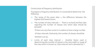
  • 10. Construction of frequency distribution To prepare a frequency distribution it is essential to determine the following: 1) The range of the given data =, the difference between the highest and lowest scores. 2) The number of class intervals = There is no hard and fast rules regarding the number of classes into which data should be grouped. If there are very few scores it is useless to have a large number of class-intervals.Ordinarily, the number of classes should be between 5 to 30. 1) Limits of each class interval = Another factor used in determining the number of classes is the size/ width or range of the class which is known as ‘class interval’ and is denoted by ‘i’.
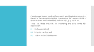
  • 11. Class interval should be of uniform width resulting in the same-size classes of frequency distribution. The width of the class should be a whole number and conveniently divisible by 2, 3, 5, 10, or 20. There are three methods for describing the class limits for distribution: (i) Exclusive method, (ii) Inclusive method and (iii) True or actual class method.
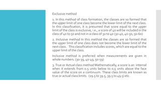
  • 12. Exclusive method 1. In this method of class formation, the classes are so formed that the upper limit of one class become the lower limit of the next class. In this classification, it is presumed that score equal to the upper limit of the class is exclusive, i.e., a score of 40 will be included in the class of 40 to 50 and not in a class of 30 to 40 (30-40, 40-50, 50-60) 2. Inclusive method In this method the classes are so formed that the upper limit of one class does not become the lower limit of the next class. This classification includes scores, which are equal to the upper limit of the class. Inclusive method is preferred when measurements are given in whole numbers. (30-39, 40-49, 50-59) 3. True or Actual class method Mathematically, a score is an internal when it extends from 0.5 units below to 0.5 units above the face value of the score on a continuum. These class limits are known as true or actual class limits. (29.5 to 39.5, 39.5 to 49.5) etc.
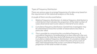
  • 13. Types of Frequency Distribution There are various ways to arrange frequencies of a data array based on the requirement of the statistical analysis or the study. A couple of them are discussed below: i) Relative frequency distribution:A relative frequency distribution is a distribution that indicates the proportion of the total number of cases observed at each score value or internal of score values. ii) Cumulative frequency distribution: Sometimes investigator may be interested to know the number of observations less than a particular value. iii) This is possible by computing the cumulative frequency. A cumulative frequency corresponding to a class-interval is the sum of frequencies for that class and of all classes prior to that class. iii) Cumulative relative frequency distribution:A cumulative relative frequency distribution is one in which the entry of any score of class interval expresses that score’s cumulative frequency as a proportion of the total number of cases.
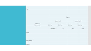
  • 14. Tabulation Frequency distribution can be either in the form of a table or it can be in the form of graph. Tabulation is the process of presenting the classified data in the form of a table. A tabular presentation of data becomes more intelligible and fit for further statistical analysis. A table is a systematic arrangement of classified data in row and columns with appropriate headings and sub-headings. The main components of a table are: i) Table number: When there is more than one table in a particular analysis a table should be marked with a number for their reference and identification. The number should be written in the center at the top of the table.
  • 15. Title of the table: Every table should have an appropriate title, which describes the content of the table. The title should be clear, brief, and self-explanatory. Title of the table should be placed either centrally on the top of the table or just below or after the table number. iii) Caption: Captions are brief and self-explanatory headings for columns. Captions may involve headings and sub-headings. The captions should be placed in the middle of the columns. For example, we can divide students of a class into males and females, rural and urban, high SES and Low SES etc. iv) Stub: Stubs stand for brief and self-explanatory headings for rows. v) Body of the table: This is the real table and contains numerical information or data in different cells. This arrangement of data remains according to the description of captions and stubs.
  • 16. vi) Head note: This is written at the extreme right hand below the title and explains the unit of the measurements used in the body of the tables. vii) Footnote: This is a qualifying statement which is to be written below the table explaining certain points related to the data which have not been covered in title, caption, and stubs. viii) Source of data: The source from which data have been taken is to be mentioned at the end of the table.
  • 17. Title Stub Head Stub Entries Caption Column Head I Column Head II Sub Head Sub Head Sub Head Sub Head Main Body of the Table Total Foot Note(s): Source
  • 18. Graphical Presentation of Data The purpose of preparing a frequency distribution is to provide a systematic way of “ looking at” and understanding data. To extend this understanding, the information contained in a frequency distribution often is displayed in graphic and/or diagrammatic forms. In graphical presentation of frequency distribution, frequencies are plotted on a pictorial platform formed of horizontal and vertical lines known as graph. A graph is created on two mutually perpendicular lines called the X andY–axes on which appropriate scales are indicated. The horizontal line is called the abscissa and vertical the ordinate. Like different kinds of frequency distributions there are many kinds of graph too, which enhance the scientific understanding of the reader.
  • 19. The commonly used graphs are Histogram, Frequency polygon, Frequency curve, Cumulative frequency curve. Here we will discuss some of the important types of graphical patterns used in statistics. i) Histogram: It is one of the most popular methods for presenting continuous frequency distribution in a form of graph. In this type of distribution the upper limit of a class is the lower limit of the following class. The histogram consists of series of rectangles, with its width equal to the class interval of the variable on horizontal axis and the corresponding frequency on the vertical axis as its heights. ii) Frequency polygon: Prepare an abscissa originating from ‘O’ and ending to ‘X’. Again construct the ordinate starting from ‘O’ and ending at ‘Y’. Now label the class-intervals on abscissa stating the exact limits or midpoints of the class intervals. You can also add one extra limit keeping zero frequency on both side of the class-interval range.
  • 20. The size of measurement of small squares on graph paper depends upon the number of classes to be plotted. Next step is to plot the frequencies on ordinate using the most comfortable measurement of small squares depending on the range of whole distribution. To plot a frequency polygon you have to mark each frequency against its concerned class on the height of its respective ordinate. After putting all frequency marks a draw a line joining the points. This is the polygon. iii) Frequency curve: A frequency curve is a smooth free hand curve drawn through frequency polygon. The objective of smoothing of the frequency polygon is to eliminate as far as possible the random or erratic fluctuations that are present in the data.
  • 21. Cumulative Frequency Curve or Ogive The graph of a cumulative frequency distribution is known as cumulative frequency curve or ogive. Since there are two types of cumulative frequency distribution e.g., “ less than” and “ more than” cumulative frequencies. We can have two types of ogives. i) ‘Less than’ Ogive: In ‘less than’ ogive , the less than cumulative frequencies are plotted against the upper class boundaries of the respective classes. It is an increasing curve having slopes upwards from left to right. ii) ‘More than’ Ogive : In more than ogive , the more than cumulative frequencies are plotted against the lower class boundaries of the respective classes. It is decreasing curve and slopes downwards from left to right.
  • 22. Diagrammatic Presentation of Data A diagram is a visual form for the presentation of statistical data. They present the data in simple , readily comprehensible form. Diagrammatic presentation is used only for presentation of the data in visual form, whereas graphic presentation of the data can be used for further analysis. There are different forms of diagram e.g., Bar diagram, Sub-divided bar diagram, Multiple bar diagram, Pie diagram and Pictogram. i) Bar diagram: Bar diagram is most useful for categorical data. A bar is defined as a thick line. Bar diagram is drawn from the frequency distribution table representing the variable on the horizontal axis and the frequency on the vertical axis. The height of each bar will be corresponding to the frequency or value of the variable. ii) Sub- divided bar diagram: Study of sub classification of a phenomenon can be done by using sub-divided bar diagram. Corresponding to each sub-category of the data the bar is divided and shaded. There will be as many shades as there will sub portion in a group of data. The portion of the bar occupied by each sub-class reflects its proportion in the total.
  • 23. iii) Multiple Bar diagram: This diagram is used when comparisons are to be shown between two or more sets of interrelated phenomena or variables. A set of bars for person, place or related phenomena are drawn side by side without any gap. To distinguish between the different bars in a set , different colours , shades are used. iv) Pie diagram: It is also known as angular diagram. A pie chart or diagram is a circle divided into component sectors corresponding to the frequencies of the variables in the distribution. Each sector will be proportional to the frequency of the variable in the group. A circle represents 360O. So 360O angles is divided in proportion to percentages. The degrees represented by the various component parts of given magnitude can be obtained by using this formula.
  • 24. After the calculation of the angles for each component, segments are drawn in the circle in succession, corresponding to the angles at the center for each segment. Different segments are shaded with different colors, shades or numbers.