SlideShare a Scribd company logo
2
Most read
3
Most read
6
Most read
Atmiya Institute of Technology & Science – General Department Page 1
B.E. Sem-IV
Sub: NUMERICAL AND STATISTICAL METHODS FOR COMPUTER ENGINEERING
(2140706)
Topic: Basic Concepts of Statistics
 Introduction
The word “Statistics” appears to have been derived from the Latin word Status or the Italian word
Statista, both meaning a “manner of standing” or “position”
Statistical techniques have been widely used in many diverse area of scientific investigation.
The application of statistics is broad indeed and includes business, marketing, economics, agriculture,
education, psychology, sociology, anthropology and biology in addition to our special interest
computer science.
 Some Statistical Terms
Data are obtained largely by two methods
(a) By counting - for example, the number of days on which rain falls in a month for each month
of the year, and
(b) By measurement - for example, the heights of a group of people.
Discrete and continuous data
When data are obtained by counting and only whole numbers are possible, the data are called
discrete. For example:- the number of stamps sold by a post office in equal period of time.
Measured data can have any value within certain limits are called continuous. For example:- the time
that a battery lasts is measured and can have any value between certain limits.
Set, population and sample
A set is a group of data and an individual value within the set is called a member of the set.
For example:- if the weights of five students are measured correct to the nearest 0.1 kg are found to
be 53.1 kg, 59.4 kg, 62.1 kg, 72.8 kg and 64.4 kg, then the set of weights in kilograms for these
students is {53.1, 59.4, 62A, 77.8, 64.4} and one of the member of set is 77.8
A set containing all the numbers is called a population. Some members selected at random from a
population are called a sample.
Basic of Statistics
Atmiya Institute of Technology & Science – General Department Page 2
For example:- Thus all scooter registration numbers form a population, but the registration numbers
of say, 10 scooters taken at random throughout the country are a sample drawn from that
population.
Frequency and relative frequency
The number of times that the value of a member occurs in a set called the frequency of that
member. For example:- In the set : {2, 3, 4, 5, 4, 2, 4, 7, 9}, the member 4 has a frequency of three,
member 2 has a frequency 2 and the other members have a frequency of one.
The relative frequency with which any member of a set occurs is given by the
ratio =
frequency	of	a	member
total	frequency	of	all	members
For example:- For the set: {2, 3, 5, 4, 7, 5, 6, 2, 8}, the relative frequency of member 5 is 2/9.
Often, relative frequency is expressed as a percentage and the percentage relative frequency is
(relative frequency X 100)%
E.g:- Data are obtained on the topics given below. State whether they are discrete or continuous.
(a) The amount of petrol produced daily for each of 31 days by a refinery
(b) The number of bottles of milk delivered daily by each of 20 milkmen,
(c) The time taken by each of 12 athletes to run 100 meters.
(d) The number of defective tablets produced in each of 10 one—hour periods by a machine.
Ans:- (a) (b) (c) (d)
 Data analysis
Presentation of Ungrouped Data
When the number of members in a set is small say ten or less, the data can be represented
diagrammatically without further analysis, these include
(a) Pictograms or Picture diagrams
It is a popular method to express the frequency of occurrence of events to a common man
such as attacks, deaths, number operated, accidents in a population. In which pictorial
symbols are used to represent quantities in horizontal line.
Basic of Statistics
Atmiya Institute of Technology & Science – General Department Page 3
E.g.:- The number of television sets repaired in a workshop by a technician in six, one month period is
as shown below. Present these data as a pictogram.
Month Number of TV’s repaired
January 11
February 6
March 15
April 9
May 13
June 8
Ans:-
Month Number of TV sets repaired = 2 sets
January
February
March
April
May
June
Each symbol shown in above table represents two television sets repaired. Thus in January 5 1/2
symbols are used to present the 11 sets repaired, in February 3 symbols are used to represent the 6
sets repaired and so on.
(b) Bar charts or Bar diagrams
Bar chart or diagram is a popular and easy method adopted for visual comparison of the
magnitude of different frequencies in discrete data. . Bars may be drawn in ascending or
descending order of magnitude or in the serial order of events. Spacing between any two bars
should be nearly equal to half of the width of the bar.
The data represented by equally spaced horizontal rectangles is called horizontal bar charts
and the data represented by equally spaced vertical rectangles is called vertical bar charts.
Basic of Statistics
Atmiya Institute of Technology & Science – General Department Page 4
E.g.:- The distance in kilometers travelled by 4 salesman in a week are as shown below.
Salesman P Q R S
Distance travelled (km) 413 264 597 143
Use horizontal bar chart to represent these data diagrammatically.
Ans:-
Distance travelled (km)
E.g.:- The number of issues of tools from a store in a factory is observed for seven, one-hour periods
in a day and the results of the survey are as follows:
Period 1 2 3 4 5 6 7
Number of issues 34 17 9 5 27 13 6
Present these data on vertical bar chart.
Ans.:-
Salesman
Basic of Statistics
Atmiya Institute of Technology & Science – General Department Page 5
(c) Pie diagram:
In a pie diagram, the area of a circle represents the whole and the areas of the sectors of the
circle are made proportional to the parts which make up the whole.
E.g.:- The retail price of a product costing Rs. 2 is made up as follows: materials 10p, labour 20p,
research and development 40p, overheads 70p, profit 60p. Present these data on pie diagram.
Ans.:- A circle of any radius is drawn, and the area of the circle represents the whole, which in this
case is Rs. 2. The circle is subdivided into sectors, so that the areas of the sectors are proportional to
the parts i.e., the parts which make up the total retail price. For the area of a sector to be
proportional to a part, the angle at the centre of the circle must he proportional to that part. The
whole, Rs. 2 or 200p, corresponds to 360
◦
.
Therefore
10p corresponds to
10
360
200
 degrees = ______
◦
20p corresponds to 360
200
 degrees = ______
◦
40p corresponds to 360
200
 degrees = ______
◦
70p corresponds to 360
200
 degrees = ______
◦
60p corresponds to 360
200
 degrees = ______
◦
The pie diagram is shown below:
Basic of Statistics
Atmiya Institute of Technology & Science – General Department Page 6
 Presentation of Group data – Frequency Distributions
Variable
A quantity which can vary from one individual to another is called a variable. It is also called a
variate. For example:- Wages, rain fall records, heights and weights.
Quantities which can take any numerical value within a certain range are called continuous variables.
For example:- The height of a child at various ages is continuous variable since as the child grows
from 120 cm to 150 cm his height assumes all possible values within the limit.
The quantities which are incapable of taking all possible values are called discontinuous or discrete
variable. For example:- The number of rooms in a house can take only the integral values such as 2,
3, 4 etc.
Frequency Distributions
If some values of a variate are collected in arbitrary order in which they occur, the mind cannot
properly grasp the significance of the data.
For example:- The number of miles that the employees of a large department store traveled to work
each day
1 2 6 7 12 13 2 6 9 5
18 7 3 15 15 4 17 1 14 5
4 16 4 5 8 6 5 18 5 2
9 11 12 1 9 2 10 11 4 10
9 18 8 8 4 14 7 3 2 6
The data is given in the crude (or raw) form. The data given in this form is called ungrouped data. If
the data is arranged in ascending or descending order of magnitude it is said to be arranged in an
array.
The range of the data is the value obtained by taking the value of the smallest member from that of
the largest number.
The data shows the range= ______ - _______ = _________
Basic of Statistics
Atmiya Institute of Technology & Science – General Department Page 7
The size of each class is given approximately by range divided by the number of classes.
Suppose 6 classes are required, then the size of each class is
________ / ________ = _________ approximately.
To achieve six equal classes spanning a range of values from 1 to 18, the class-intervals are selected as
1 – 3 , 4 – 6, _____ - _______ ,
This method of arrangement is called a tally method or tally diagram.
Table:1
Class Tally
Class mid-
point
Frequency
Commutative
Frequency
Basic of Statistics
Atmiya Institute of Technology & Science – General Department Page 8
Those members having similar values are grouped together; such groups are called classes and the
boundary ends
_____, ______, _____, ______, _____, ______,
called class limits.
In the class limits 1 – 3 , 1 is the lower limit, 3 is the upper limit. The difference between upper and
lower limits of a class is called its magnitude or class-interval. For example:- class-interval of the class
of the class 1-3 is 2.
The number of observations falling with in a particular class is called its frequency or class frequency.
For example:-The frequency of the class __________ is ________.
The variate value which lies mid-way between the upper and lower limit is called mid-value or mid-
point of that class.
The cumulative frequency corresponding to a class is the total of all the frequencies up to and
including that class.
Basic of Statistics
Atmiya Institute of Technology & Science – General Department Page 9
 Graphical Representation of Grouped Data
Generally the following types of graphs are used in representing frequency distributions:
(1) Histogram
(2) Frequency polygon and frequency curve
(3) Ogive or Cumulative frequency distribution curve
(1) Histogram
One of the principal ways of presenting grouped data diagrammatically is by using a
histogram in which the areas of vertical, adjacent rectangles are made proportional to
frequencies of the classes.
When class intervals are equal, the heights of the rectangles of histograms are equal to the
frequencies of the classes.
For histograms having unequal class intervals, the area must be proportional to the
frequency. For example:- Hence, if the class interval if class A is twice the class interval of class
B, then for equal frequencies, the height of rectangle representing A is half that of B.
E.g.:- Construct a histogram for the data given in Table:1
Class mid-point value
The width of the rectangles corresponding to upper class boundary values minus the lower class
boundary values and the heights of the rectangles correspond to the class frequencies.
Basic of Statistics
Atmiya Institute of Technology & Science – General Department Page 10
(2) Frequency polygon and Frequency curve
Frequency polygon is a graph obtained by plotting frequency against mid points values and
joining the co—ordinates with straight lines.
If the class intervals are very small the frequency polygon assumes the form of a smooth
curve known as the frequency curve.
E.g.:- Draw the frequency polygon for the data given in the table.
Class Class mid-point Frequency
7.1 - 7.3 7.2 3
7.4 – 7.6 7.5 5
7.7 – 7.9 7.8 9
8.0 – 8.2 8.1 14
8.3 – 8.5 8.4 11
8.6 – 8.8 8.7 6
8.9 – 9.1 9.0 2
Class mid-point vlaue
A frequency polygon is shown in Fig, the co—ordinates corresponding to the class mid—point
verses frequency values given in Table.
Frequency
Basic of Statistics
Atmiya Institute of Technology & Science – General Department Page 11
(3) Ogive or Cumulative Frequency Distribution Curve
The curve obtained by joining the co—ordinates of cumulative frequency (vertically) against
upper class boundary (horizontally) is called an ogive or a cumulative frequency distribution
curve.
E.g.:- The frequency distribution for marks of 50 students is given in the following table.
Marks class 0-10 10-20 20-30 30-40 40-50 50-60 60-70 70-80 80-90 90-100
Frequency 2 4 10 4 3 8 1 5 11 2
Form a cumulative frequency distribution for these data and draw the corresponding ogive.
Ans.:-
Mark Class Frequency
Upper Class
Boundary
Cumulative
Frequency
0 - 10 2 10 2
10 – 20 4 20 6
From a cumulative frequency table the upper class boundary of the class taken as x—coordinates and
the cumulative frequencies as the y—coordinates and the points are plotted, then these points when
joined by freehand smooth curve give the cumulative frequency curve or the ogive.
Basic of Statistics
Atmiya Institute of Technology & Science – General Department Page 12
Upper Class Boundary
Frequency

More Related Content

What's hot (20)

PPTX
Basics of statistics
donthuraj
 
PPTX
SAMPLING ; SAMPLING TECHNIQUES – RANDOM SAMPLING (SIMPLE RANDOM SAMPLING)
Navya Jayakumar
 
PPTX
What is statistics
Raj Teotia
 
PPTX
Types of random sampling
Studying
 
PPSX
Inferential statistics.ppt
Nursing Path
 
PPT
Data presentation 2
Rawalpindi Medical College
 
PPTX
Quantitative Research
syerencs
 
PPTX
Descriptive statistics
Sarfraz Ahmad
 
PPTX
Statistics in research
Balaji P
 
PPTX
Presentation on stratified sampling
Krishna Bharati
 
PDF
Data analysis
Nursing Path
 
PPTX
Quantitative analysis
Pachica, Gerry B.
 
PDF
Data analysis
Aleeza Ahmad
 
PPTX
Univariate Analysis
Soumya Sahoo
 
PPTX
Data Analysis, Presentation and Interpretation of Data
Roqui Malijan
 
PDF
Introduction to Statistics
Anjan Mahanta
 
PPTX
Statistics "Descriptive & Inferential"
Dalia El-Shafei
 
PPTX
Simple random sampling
suncil0071
 
PPTX
Stratified sampling
suncil0071
 
PPTX
Univariate & bivariate analysis
sristi1992
 
Basics of statistics
donthuraj
 
SAMPLING ; SAMPLING TECHNIQUES – RANDOM SAMPLING (SIMPLE RANDOM SAMPLING)
Navya Jayakumar
 
What is statistics
Raj Teotia
 
Types of random sampling
Studying
 
Inferential statistics.ppt
Nursing Path
 
Data presentation 2
Rawalpindi Medical College
 
Quantitative Research
syerencs
 
Descriptive statistics
Sarfraz Ahmad
 
Statistics in research
Balaji P
 
Presentation on stratified sampling
Krishna Bharati
 
Data analysis
Nursing Path
 
Quantitative analysis
Pachica, Gerry B.
 
Data analysis
Aleeza Ahmad
 
Univariate Analysis
Soumya Sahoo
 
Data Analysis, Presentation and Interpretation of Data
Roqui Malijan
 
Introduction to Statistics
Anjan Mahanta
 
Statistics "Descriptive & Inferential"
Dalia El-Shafei
 
Simple random sampling
suncil0071
 
Stratified sampling
suncil0071
 
Univariate & bivariate analysis
sristi1992
 

Similar to Basic Concepts of Statistics - Lecture Notes (20)

PDF
Statistics and statistical methods pdf.
omegaadrian33
 
PPT
Chapter01
rwmiller
 
PPT
Chapter01
rwmiller
 
PPTX
WEEK 3 and 4- Formulation and Presentation of Data.pptx
roxanmecate
 
PDF
Introduction to Statistics
Dr. Tushar J Bhatt
 
PPTX
Type of data @ Web Mining Discussion
CherryBerry2
 
PDF
Chapter 4 MMW.pdf
RaRaRamirez
 
PPTX
Data handling
Advetya Pillai
 
PPT
Introduction to statistics
Shaamma(Simi_ch) Fiverr
 
PPTX
Stat-Lesson.pptx
JennilynFeliciano2
 
PPTX
DATA UNIT-3.pptx
bibha737
 
PPT
Introduction to Statistics
teena1991
 
PPTX
Frequency Distribution – An Essential Concept in Statistics
priyasinghy107
 
PPT
Manpreet kay bhatia Business Statistics.ppt
Noorien3
 
PPTX
Introduction to Statistics and Arithmetic Mean
Mamatha Upadhya
 
PPT
Statistics-24-04-2021-20210618114031.ppt
RajnishSingh367990
 
PPT
Statistics-24-04-2021-20210618114031.ppt
JapnaamKaurAhluwalia
 
PPT
Statistics-24-04-2021-20210618114031.ppt
Akhtaruzzamanlimon1
 
PPTX
Type of data @ web mining discussion
CherryBerry2
 
PDF
2. week 2 data presentation and organization
renz50
 
Statistics and statistical methods pdf.
omegaadrian33
 
Chapter01
rwmiller
 
Chapter01
rwmiller
 
WEEK 3 and 4- Formulation and Presentation of Data.pptx
roxanmecate
 
Introduction to Statistics
Dr. Tushar J Bhatt
 
Type of data @ Web Mining Discussion
CherryBerry2
 
Chapter 4 MMW.pdf
RaRaRamirez
 
Data handling
Advetya Pillai
 
Introduction to statistics
Shaamma(Simi_ch) Fiverr
 
Stat-Lesson.pptx
JennilynFeliciano2
 
DATA UNIT-3.pptx
bibha737
 
Introduction to Statistics
teena1991
 
Frequency Distribution – An Essential Concept in Statistics
priyasinghy107
 
Manpreet kay bhatia Business Statistics.ppt
Noorien3
 
Introduction to Statistics and Arithmetic Mean
Mamatha Upadhya
 
Statistics-24-04-2021-20210618114031.ppt
RajnishSingh367990
 
Statistics-24-04-2021-20210618114031.ppt
JapnaamKaurAhluwalia
 
Statistics-24-04-2021-20210618114031.ppt
Akhtaruzzamanlimon1
 
Type of data @ web mining discussion
CherryBerry2
 
2. week 2 data presentation and organization
renz50
 
Ad

More from Dr. Nirav Vyas (20)

PDF
Advance Topics in Latex - different packages
Dr. Nirav Vyas
 
PPTX
Numerical Methods Algorithm and C Program
Dr. Nirav Vyas
 
PDF
Reduction forumla
Dr. Nirav Vyas
 
PPTX
Arithmetic Mean, Geometric Mean, Harmonic Mean
Dr. Nirav Vyas
 
PPTX
Geometric progressions
Dr. Nirav Vyas
 
PPTX
Arithmetic progressions
Dr. Nirav Vyas
 
PPTX
Combinations
Dr. Nirav Vyas
 
PPTX
Permutation
Dr. Nirav Vyas
 
PPTX
Matrices and Determinants
Dr. Nirav Vyas
 
PDF
Curve fitting - Lecture Notes
Dr. Nirav Vyas
 
PDF
Trend analysis - Lecture Notes
Dr. Nirav Vyas
 
PDF
Numerical Methods - Power Method for Eigen values
Dr. Nirav Vyas
 
PDF
Numerical Methods - Oridnary Differential Equations - 3
Dr. Nirav Vyas
 
PDF
Numerical Methods - Oridnary Differential Equations - 2
Dr. Nirav Vyas
 
PDF
Numerical Methods - Oridnary Differential Equations - 1
Dr. Nirav Vyas
 
PDF
Partial Differential Equation - Notes
Dr. Nirav Vyas
 
PDF
Special functions
Dr. Nirav Vyas
 
PDF
Legendre Function
Dr. Nirav Vyas
 
PDF
Laplace Transforms
Dr. Nirav Vyas
 
PDF
Fourier series 3
Dr. Nirav Vyas
 
Advance Topics in Latex - different packages
Dr. Nirav Vyas
 
Numerical Methods Algorithm and C Program
Dr. Nirav Vyas
 
Reduction forumla
Dr. Nirav Vyas
 
Arithmetic Mean, Geometric Mean, Harmonic Mean
Dr. Nirav Vyas
 
Geometric progressions
Dr. Nirav Vyas
 
Arithmetic progressions
Dr. Nirav Vyas
 
Combinations
Dr. Nirav Vyas
 
Permutation
Dr. Nirav Vyas
 
Matrices and Determinants
Dr. Nirav Vyas
 
Curve fitting - Lecture Notes
Dr. Nirav Vyas
 
Trend analysis - Lecture Notes
Dr. Nirav Vyas
 
Numerical Methods - Power Method for Eigen values
Dr. Nirav Vyas
 
Numerical Methods - Oridnary Differential Equations - 3
Dr. Nirav Vyas
 
Numerical Methods - Oridnary Differential Equations - 2
Dr. Nirav Vyas
 
Numerical Methods - Oridnary Differential Equations - 1
Dr. Nirav Vyas
 
Partial Differential Equation - Notes
Dr. Nirav Vyas
 
Special functions
Dr. Nirav Vyas
 
Legendre Function
Dr. Nirav Vyas
 
Laplace Transforms
Dr. Nirav Vyas
 
Fourier series 3
Dr. Nirav Vyas
 
Ad

Recently uploaded (20)

PPTX
2025 Winter SWAYAM NPTEL & A Student.pptx
Utsav Yagnik
 
PPTX
Views on Education of Indian Thinkers Mahatma Gandhi.pptx
ShrutiMahanta1
 
PDF
water conservation .pdf by Nandni Kumari XI C
Directorate of Education Delhi
 
PPTX
SCHOOL-BASED SEXUAL HARASSMENT PREVENTION AND RESPONSE WORKSHOP
komlalokoe
 
PDF
07.15.2025 - Managing Your Members Using a Membership Portal.pdf
TechSoup
 
PPTX
Maternal and Child Tracking system & RCH portal
Ms Usha Vadhel
 
PPT
digestive system for Pharm d I year HAP
rekhapositivity
 
PDF
Zoology (Animal Physiology) practical Manual
raviralanaresh2
 
PPTX
ENGLISH LEARNING ACTIVITY SHE W5Q1.pptxY
CHERIEANNAPRILSULIT1
 
PPTX
Optimizing Cancer Screening With MCED Technologies: From Science to Practical...
i3 Health
 
PPTX
HIRSCHSPRUNG'S DISEASE(MEGACOLON): NURSING MANAGMENT.pptx
PRADEEP ABOTHU
 
PPTX
Modern analytical techniques used to characterize organic compounds. Birbhum ...
AyanHossain
 
PPTX
Optimizing Cancer Screening With MCED Technologies: From Science to Practical...
i3 Health
 
PDF
IMP NAAC REFORMS 2024 - 10 Attributes.pdf
BHARTIWADEKAR
 
PPTX
HEAD INJURY IN CHILDREN: NURSING MANAGEMENGT.pptx
PRADEEP ABOTHU
 
PDF
FULL DOCUMENT: Read the full Deloitte and Touche audit report on the National...
Kweku Zurek
 
PPTX
Folding Off Hours in Gantt View in Odoo 18.2
Celine George
 
PPTX
Nutri-QUIZ-Bee-Elementary.pptx...................
ferdinandsanbuenaven
 
PPTX
How to Define Translation to Custom Module And Add a new language in Odoo 18
Celine George
 
PPTX
nutriquiz grade 4.pptx...............................................
ferdinandsanbuenaven
 
2025 Winter SWAYAM NPTEL & A Student.pptx
Utsav Yagnik
 
Views on Education of Indian Thinkers Mahatma Gandhi.pptx
ShrutiMahanta1
 
water conservation .pdf by Nandni Kumari XI C
Directorate of Education Delhi
 
SCHOOL-BASED SEXUAL HARASSMENT PREVENTION AND RESPONSE WORKSHOP
komlalokoe
 
07.15.2025 - Managing Your Members Using a Membership Portal.pdf
TechSoup
 
Maternal and Child Tracking system & RCH portal
Ms Usha Vadhel
 
digestive system for Pharm d I year HAP
rekhapositivity
 
Zoology (Animal Physiology) practical Manual
raviralanaresh2
 
ENGLISH LEARNING ACTIVITY SHE W5Q1.pptxY
CHERIEANNAPRILSULIT1
 
Optimizing Cancer Screening With MCED Technologies: From Science to Practical...
i3 Health
 
HIRSCHSPRUNG'S DISEASE(MEGACOLON): NURSING MANAGMENT.pptx
PRADEEP ABOTHU
 
Modern analytical techniques used to characterize organic compounds. Birbhum ...
AyanHossain
 
Optimizing Cancer Screening With MCED Technologies: From Science to Practical...
i3 Health
 
IMP NAAC REFORMS 2024 - 10 Attributes.pdf
BHARTIWADEKAR
 
HEAD INJURY IN CHILDREN: NURSING MANAGEMENGT.pptx
PRADEEP ABOTHU
 
FULL DOCUMENT: Read the full Deloitte and Touche audit report on the National...
Kweku Zurek
 
Folding Off Hours in Gantt View in Odoo 18.2
Celine George
 
Nutri-QUIZ-Bee-Elementary.pptx...................
ferdinandsanbuenaven
 
How to Define Translation to Custom Module And Add a new language in Odoo 18
Celine George
 
nutriquiz grade 4.pptx...............................................
ferdinandsanbuenaven
 

Basic Concepts of Statistics - Lecture Notes

  • 1. Atmiya Institute of Technology & Science – General Department Page 1 B.E. Sem-IV Sub: NUMERICAL AND STATISTICAL METHODS FOR COMPUTER ENGINEERING (2140706) Topic: Basic Concepts of Statistics  Introduction The word “Statistics” appears to have been derived from the Latin word Status or the Italian word Statista, both meaning a “manner of standing” or “position” Statistical techniques have been widely used in many diverse area of scientific investigation. The application of statistics is broad indeed and includes business, marketing, economics, agriculture, education, psychology, sociology, anthropology and biology in addition to our special interest computer science.  Some Statistical Terms Data are obtained largely by two methods (a) By counting - for example, the number of days on which rain falls in a month for each month of the year, and (b) By measurement - for example, the heights of a group of people. Discrete and continuous data When data are obtained by counting and only whole numbers are possible, the data are called discrete. For example:- the number of stamps sold by a post office in equal period of time. Measured data can have any value within certain limits are called continuous. For example:- the time that a battery lasts is measured and can have any value between certain limits. Set, population and sample A set is a group of data and an individual value within the set is called a member of the set. For example:- if the weights of five students are measured correct to the nearest 0.1 kg are found to be 53.1 kg, 59.4 kg, 62.1 kg, 72.8 kg and 64.4 kg, then the set of weights in kilograms for these students is {53.1, 59.4, 62A, 77.8, 64.4} and one of the member of set is 77.8 A set containing all the numbers is called a population. Some members selected at random from a population are called a sample.
  • 2. Basic of Statistics Atmiya Institute of Technology & Science – General Department Page 2 For example:- Thus all scooter registration numbers form a population, but the registration numbers of say, 10 scooters taken at random throughout the country are a sample drawn from that population. Frequency and relative frequency The number of times that the value of a member occurs in a set called the frequency of that member. For example:- In the set : {2, 3, 4, 5, 4, 2, 4, 7, 9}, the member 4 has a frequency of three, member 2 has a frequency 2 and the other members have a frequency of one. The relative frequency with which any member of a set occurs is given by the ratio = frequency of a member total frequency of all members For example:- For the set: {2, 3, 5, 4, 7, 5, 6, 2, 8}, the relative frequency of member 5 is 2/9. Often, relative frequency is expressed as a percentage and the percentage relative frequency is (relative frequency X 100)% E.g:- Data are obtained on the topics given below. State whether they are discrete or continuous. (a) The amount of petrol produced daily for each of 31 days by a refinery (b) The number of bottles of milk delivered daily by each of 20 milkmen, (c) The time taken by each of 12 athletes to run 100 meters. (d) The number of defective tablets produced in each of 10 one—hour periods by a machine. Ans:- (a) (b) (c) (d)  Data analysis Presentation of Ungrouped Data When the number of members in a set is small say ten or less, the data can be represented diagrammatically without further analysis, these include (a) Pictograms or Picture diagrams It is a popular method to express the frequency of occurrence of events to a common man such as attacks, deaths, number operated, accidents in a population. In which pictorial symbols are used to represent quantities in horizontal line.
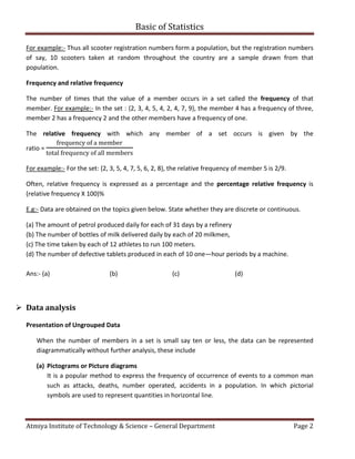
  • 3. Basic of Statistics Atmiya Institute of Technology & Science – General Department Page 3 E.g.:- The number of television sets repaired in a workshop by a technician in six, one month period is as shown below. Present these data as a pictogram. Month Number of TV’s repaired January 11 February 6 March 15 April 9 May 13 June 8 Ans:- Month Number of TV sets repaired = 2 sets January February March April May June Each symbol shown in above table represents two television sets repaired. Thus in January 5 1/2 symbols are used to present the 11 sets repaired, in February 3 symbols are used to represent the 6 sets repaired and so on. (b) Bar charts or Bar diagrams Bar chart or diagram is a popular and easy method adopted for visual comparison of the magnitude of different frequencies in discrete data. . Bars may be drawn in ascending or descending order of magnitude or in the serial order of events. Spacing between any two bars should be nearly equal to half of the width of the bar. The data represented by equally spaced horizontal rectangles is called horizontal bar charts and the data represented by equally spaced vertical rectangles is called vertical bar charts.
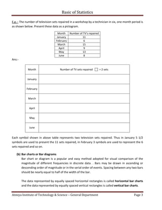
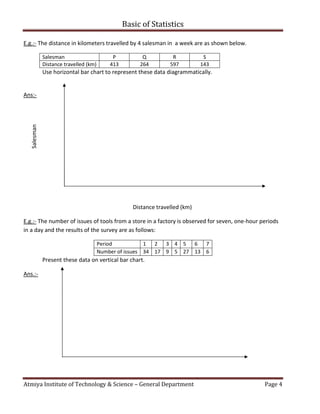
  • 4. Basic of Statistics Atmiya Institute of Technology & Science – General Department Page 4 E.g.:- The distance in kilometers travelled by 4 salesman in a week are as shown below. Salesman P Q R S Distance travelled (km) 413 264 597 143 Use horizontal bar chart to represent these data diagrammatically. Ans:- Distance travelled (km) E.g.:- The number of issues of tools from a store in a factory is observed for seven, one-hour periods in a day and the results of the survey are as follows: Period 1 2 3 4 5 6 7 Number of issues 34 17 9 5 27 13 6 Present these data on vertical bar chart. Ans.:- Salesman
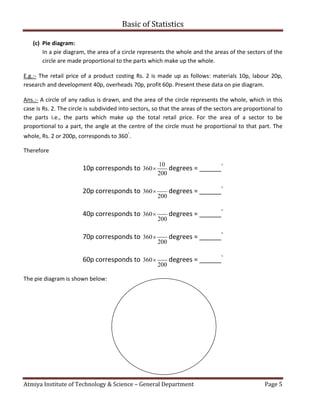
  • 5. Basic of Statistics Atmiya Institute of Technology & Science – General Department Page 5 (c) Pie diagram: In a pie diagram, the area of a circle represents the whole and the areas of the sectors of the circle are made proportional to the parts which make up the whole. E.g.:- The retail price of a product costing Rs. 2 is made up as follows: materials 10p, labour 20p, research and development 40p, overheads 70p, profit 60p. Present these data on pie diagram. Ans.:- A circle of any radius is drawn, and the area of the circle represents the whole, which in this case is Rs. 2. The circle is subdivided into sectors, so that the areas of the sectors are proportional to the parts i.e., the parts which make up the total retail price. For the area of a sector to be proportional to a part, the angle at the centre of the circle must he proportional to that part. The whole, Rs. 2 or 200p, corresponds to 360 ◦ . Therefore 10p corresponds to 10 360 200  degrees = ______ ◦ 20p corresponds to 360 200  degrees = ______ ◦ 40p corresponds to 360 200  degrees = ______ ◦ 70p corresponds to 360 200  degrees = ______ ◦ 60p corresponds to 360 200  degrees = ______ ◦ The pie diagram is shown below:
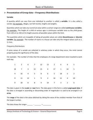
  • 6. Basic of Statistics Atmiya Institute of Technology & Science – General Department Page 6  Presentation of Group data – Frequency Distributions Variable A quantity which can vary from one individual to another is called a variable. It is also called a variate. For example:- Wages, rain fall records, heights and weights. Quantities which can take any numerical value within a certain range are called continuous variables. For example:- The height of a child at various ages is continuous variable since as the child grows from 120 cm to 150 cm his height assumes all possible values within the limit. The quantities which are incapable of taking all possible values are called discontinuous or discrete variable. For example:- The number of rooms in a house can take only the integral values such as 2, 3, 4 etc. Frequency Distributions If some values of a variate are collected in arbitrary order in which they occur, the mind cannot properly grasp the significance of the data. For example:- The number of miles that the employees of a large department store traveled to work each day 1 2 6 7 12 13 2 6 9 5 18 7 3 15 15 4 17 1 14 5 4 16 4 5 8 6 5 18 5 2 9 11 12 1 9 2 10 11 4 10 9 18 8 8 4 14 7 3 2 6 The data is given in the crude (or raw) form. The data given in this form is called ungrouped data. If the data is arranged in ascending or descending order of magnitude it is said to be arranged in an array. The range of the data is the value obtained by taking the value of the smallest member from that of the largest number. The data shows the range= ______ - _______ = _________
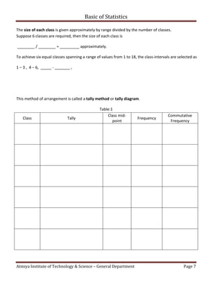
  • 7. Basic of Statistics Atmiya Institute of Technology & Science – General Department Page 7 The size of each class is given approximately by range divided by the number of classes. Suppose 6 classes are required, then the size of each class is ________ / ________ = _________ approximately. To achieve six equal classes spanning a range of values from 1 to 18, the class-intervals are selected as 1 – 3 , 4 – 6, _____ - _______ , This method of arrangement is called a tally method or tally diagram. Table:1 Class Tally Class mid- point Frequency Commutative Frequency
  • 8. Basic of Statistics Atmiya Institute of Technology & Science – General Department Page 8 Those members having similar values are grouped together; such groups are called classes and the boundary ends _____, ______, _____, ______, _____, ______, called class limits. In the class limits 1 – 3 , 1 is the lower limit, 3 is the upper limit. The difference between upper and lower limits of a class is called its magnitude or class-interval. For example:- class-interval of the class of the class 1-3 is 2. The number of observations falling with in a particular class is called its frequency or class frequency. For example:-The frequency of the class __________ is ________. The variate value which lies mid-way between the upper and lower limit is called mid-value or mid- point of that class. The cumulative frequency corresponding to a class is the total of all the frequencies up to and including that class.
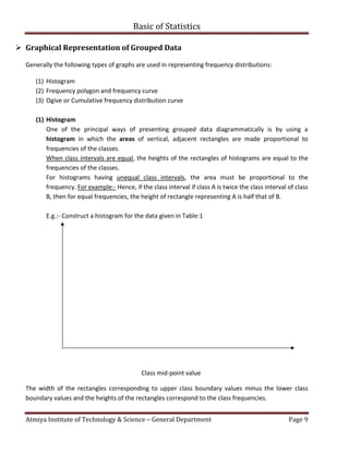
  • 9. Basic of Statistics Atmiya Institute of Technology & Science – General Department Page 9  Graphical Representation of Grouped Data Generally the following types of graphs are used in representing frequency distributions: (1) Histogram (2) Frequency polygon and frequency curve (3) Ogive or Cumulative frequency distribution curve (1) Histogram One of the principal ways of presenting grouped data diagrammatically is by using a histogram in which the areas of vertical, adjacent rectangles are made proportional to frequencies of the classes. When class intervals are equal, the heights of the rectangles of histograms are equal to the frequencies of the classes. For histograms having unequal class intervals, the area must be proportional to the frequency. For example:- Hence, if the class interval if class A is twice the class interval of class B, then for equal frequencies, the height of rectangle representing A is half that of B. E.g.:- Construct a histogram for the data given in Table:1 Class mid-point value The width of the rectangles corresponding to upper class boundary values minus the lower class boundary values and the heights of the rectangles correspond to the class frequencies.
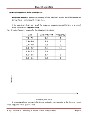
  • 10. Basic of Statistics Atmiya Institute of Technology & Science – General Department Page 10 (2) Frequency polygon and Frequency curve Frequency polygon is a graph obtained by plotting frequency against mid points values and joining the co—ordinates with straight lines. If the class intervals are very small the frequency polygon assumes the form of a smooth curve known as the frequency curve. E.g.:- Draw the frequency polygon for the data given in the table. Class Class mid-point Frequency 7.1 - 7.3 7.2 3 7.4 – 7.6 7.5 5 7.7 – 7.9 7.8 9 8.0 – 8.2 8.1 14 8.3 – 8.5 8.4 11 8.6 – 8.8 8.7 6 8.9 – 9.1 9.0 2 Class mid-point vlaue A frequency polygon is shown in Fig, the co—ordinates corresponding to the class mid—point verses frequency values given in Table. Frequency
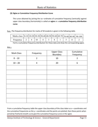
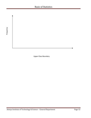
  • 11. Basic of Statistics Atmiya Institute of Technology & Science – General Department Page 11 (3) Ogive or Cumulative Frequency Distribution Curve The curve obtained by joining the co—ordinates of cumulative frequency (vertically) against upper class boundary (horizontally) is called an ogive or a cumulative frequency distribution curve. E.g.:- The frequency distribution for marks of 50 students is given in the following table. Marks class 0-10 10-20 20-30 30-40 40-50 50-60 60-70 70-80 80-90 90-100 Frequency 2 4 10 4 3 8 1 5 11 2 Form a cumulative frequency distribution for these data and draw the corresponding ogive. Ans.:- Mark Class Frequency Upper Class Boundary Cumulative Frequency 0 - 10 2 10 2 10 – 20 4 20 6 From a cumulative frequency table the upper class boundary of the class taken as x—coordinates and the cumulative frequencies as the y—coordinates and the points are plotted, then these points when joined by freehand smooth curve give the cumulative frequency curve or the ogive.
  • 12. Basic of Statistics Atmiya Institute of Technology & Science – General Department Page 12 Upper Class Boundary Frequency