
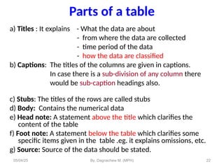
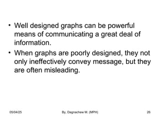


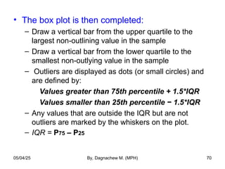
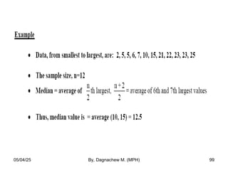
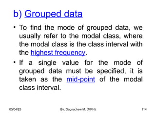
![Outlying values
• The lines coming out of the box are called the
“whiskers”.
• The ends of the “whiskers’ are called “adjacent
values) [The largest and smallest non-outlying
values].
• Upper “adjacent value” = The largest value that is
less than or equal to P75 + 1.5*(P75 – P25).
• Lower “adjacent value” = The smallest value that is
greater than or equal to P25 – 1.5*(P75 – P25).
05/04/25 By, Dagnachew M. (MPH) 69](https://izqule7twkl7vq3ljkxejyz-s-a2157.bj.tsgdht.cn/1-250504160616-93d4a7a0/85/1-Descriptive-statistics-1-pptrheology-pptx-69-320.jpg)


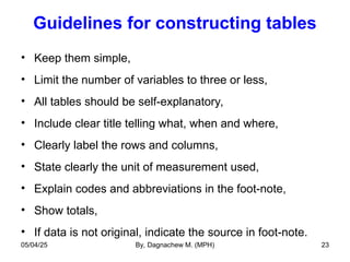
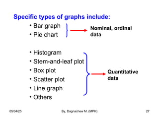
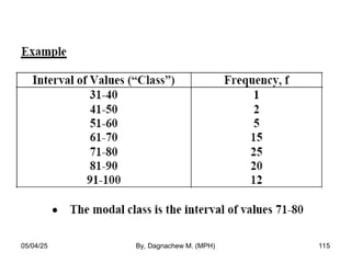
![quartile
Q1 = [(n+1)/4]th
Q2 = [2(n+1)/4]th
Q3 = [3(n+1)/4]th
05/04/25 By, Dagnachew M. (MPH) 107](https://izqule7twkl7vq3ljkxejyz-s-a2157.bj.tsgdht.cn/1-250504160616-93d4a7a0/85/1-Descriptive-statistics-1-pptrheology-pptx-107-320.jpg)

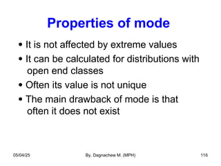

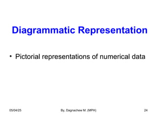
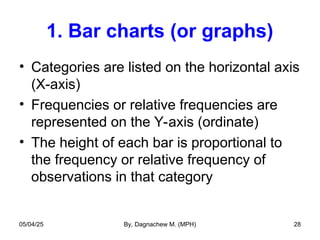
![2. Interquartile range (IQR)
• Indicates the spread of the middle 50% of
the observations, and used with median
IQR = Q3 - Q1… Where
Q1 = [(n+1)/4]th
Q2 = [2(n+1)/4]th
Q3 = [3(n+1)/4]th
• Example: Suppose the first and third quartile for
weights of girls 12 months of age are 8.8 Kg and
10.2 Kg, respectively.
IQR = 10.2 Kg – 8.8 Kg
i.e. the inner 50% of the infant girls weigh between
8.8 and 10.2 Kg.
05/04/25 By, Dagnachew M. (MPH) 129](https://izqule7twkl7vq3ljkxejyz-s-a2157.bj.tsgdht.cn/1-250504160616-93d4a7a0/85/1-Descriptive-statistics-1-pptrheology-pptx-129-320.jpg)


More Related Content
Similar to 1. Descriptive statistics(1).pptrheology.pptx (20)
Recently uploaded (20)


1. Descriptive statistics(1).pptrheology.pptx
- 1. Data collection methods • Qualitative • In-depth interview • Focus group discussion • Observation • Quantitative • Interview • Self administered questionnaire • Observation 1 05/04/25 By, Dagnachew M. (MPH)
- 2. Assignments • Qualitative data collection methods/tools • Quantitative data collection methods/tools • Random sampling methods & sample size calculations • Non random sampling methods • Demography and source of demographic data • Health service statistics 2 05/04/25 By, Dagnachew M. (MPH)
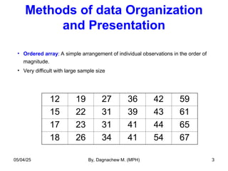
- 3. Methods of data Organization and Presentation • Ordered array: A simple arrangement of individual observations in the order of magnitude. • Very difficult with large sample size 12 19 27 36 42 59 15 22 31 39 43 61 17 23 31 41 44 65 18 26 34 41 54 67 05/04/25 By, Dagnachew M. (MPH) 3
- 4. • The actual summarization and organization of data starts from frequency distribution. • Frequency distribution: A table which has a list of each of the possible values that the data can assume along with the number of times each value occurs. 05/04/25 By, Dagnachew M. (MPH) 4
- 5. • For nominal and ordinal data, frequency distributions are often used as a summary. • Example: • The % of times that each value occurs, or the relative frequency, is often listed • Tables make it easier to see how the data are distributed 05/04/25 By, Dagnachew M. (MPH) 5
- 6. • For both discrete and continuous data, the values are grouped into non- overlapping intervals, usually of equal width. 05/04/25 By, Dagnachew M. (MPH) 6
- 7. a) Qualitative variable: Count the number of cases in each category. - Example1: The intensive care unit type of 25 patients entering ICU at a given hospital: 1. Medical 2. Surgical 3. Cardiac 4. Other 05/04/25 By, Dagnachew M. (MPH) 7
- 8. ICU Type Frequency (How often) Relative Frequency (Proportionately often) Medical Surgical Cardiac Other 12 6 5 2 0.48 0.24 0.20 0.08 Total 25 1.00 05/04/25 By, Dagnachew M. (MPH) 8
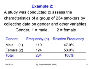
- 9. Example 2: A study was conducted to assess the characteristics of a group of 234 smokers by collecting data on gender and other variables. Gender, 1 = male, 2 = female Gender Frequency (n) Relative Frequency Male (1) Female (2) 110 124 47.0% 53.0% Total 234 100% 05/04/25 By, Dagnachew M. (MPH) 9
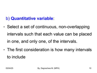
- 10. b) Quantitative variable: - Select a set of continuous, non-overlapping intervals such that each value can be placed in one, and only one, of the intervals. - The first consideration is how many intervals to include 05/04/25 By, Dagnachew M. (MPH) 10
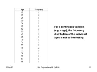
- 11. For a continuous variable (e.g. – age), the frequency distribution of the individual ages is not so interesting. 05/04/25 By, Dagnachew M. (MPH) 11
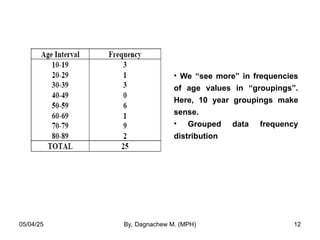
- 12. • We “see more” in frequencies of age values in “groupings”. Here, 10 year groupings make sense. • Grouped data frequency distribution 05/04/25 By, Dagnachew M. (MPH) 12
- 13. To determine the number of class intervals and the corresponding width, we may use: Sturge’s rule: where K = number of class intervals n = no. of observations W = width of the class interval L = the largest value S = the smallest value K 1 3.322(logn) W L S K 05/04/25 By, Dagnachew M. (MPH) 13
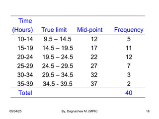
- 14. Example: – Leisure time (hours) per week for 40 college students: 23 24 18 14 20 36 24 26 23 21 16 15 19 20 22 14 13 10 19 27 29 22 38 28 34 32 23 19 21 31 16 28 19 18 12 27 15 21 25 16 K = 1 + 3.22 (log40) = 6.32 ≈ 6 Maximum value = 38, Minimum value = 10 Width = (38-10)/6 = 4.66 ≈ 5 05/04/25 By, Dagnachew M. (MPH) 14
- 15. Time (Hours) Frequency Relative Frequency Cumulative Relative Frequency 10-14 15-19 20-24 25-29 30-34 35-39 5 11 12 7 3 2 0.125 0.275 0.300 0.175 0.075 0.050 0.125 0.400 0.700 0.875 0.950 1.00 Total 40 1.00 05/04/25 By, Dagnachew M. (MPH) 15
- 16. • Frequency: it is the number of times each value occurs in the distribution • Relative Frequency: is the percent of each value occurs in the distribution • Cumulative frequencies: When frequencies of two or more classes are added. • Cumulative relative frequency: The percentage of the total number of observations that have a value either in that interval or below it. 05/04/25 By, Dagnachew M. (MPH) 16
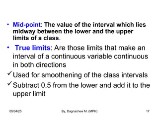
- 17. • Mid-point: The value of the interval which lies midway between the lower and the upper limits of a class. • True limits: Are those limits that make an interval of a continuous variable continuous in both directions Used for smoothening of the class intervals Subtract 0.5 from the lower and add it to the upper limit 05/04/25 By, Dagnachew M. (MPH) 17
- 18. Time (Hours) True limit Mid-point Frequency 10-14 15-19 20-24 25-29 30-34 35-39 9.5 – 14.5 14.5 – 19.5 19.5 – 24.5 24.5 – 29.5 29.5 – 34.5 34.5 - 39.5 12 17 22 27 32 37 5 11 12 7 3 2 Total 40 05/04/25 By, Dagnachew M. (MPH) 18
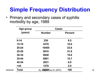
- 19. Simple Frequency Distribution • Primary and secondary cases of syphilis morbidity by age, 1989 Age group (years) Cases Number Percent 0-14 15-19 20-24 25-29 30-34 35-44 45-54 >44 230 4378 10405 9610 8648 6901 2631 1278 0.5 10.0 23.6 21.8 19.6 15.7 6.0 2.9 Total 44081 100 05/04/25 By, Dagnachew M. (MPH) 19
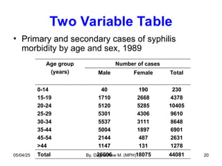
- 20. Two Variable Table • Primary and secondary cases of syphilis morbidity by age and sex, 1989 Age group (years) Number of cases Male Female Total 0-14 15-19 20-24 25-29 30-34 35-44 45-54 >44 40 1710 5120 5301 5537 5004 2144 1147 190 2668 5285 4306 3111 1897 487 131 230 4378 10405 9610 8648 6901 2631 1278 Total 26006 18075 44081 05/04/25 By, Dagnachew M. (MPH) 20
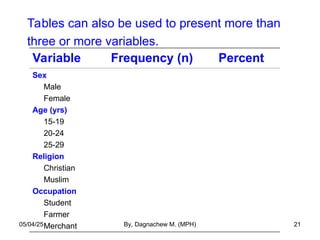
- 21. Tables can also be used to present more than three or more variables. Variable Frequency (n) Percent Sex Male Female Age (yrs) 15-19 20-24 25-29 Religion Christian Muslim Occupation Student Farmer Merchant 05/04/25 By, Dagnachew M. (MPH) 21
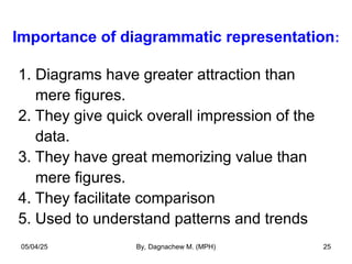
- 22. 22 Parts of a table a) Titles : It explains - What the data are about - from where the data are collected - time period of the data - how the data are classified b) Captions: The titles of the columns are given in captions. In case there is a sub-division of any column there would be sub-caption headings also. c) Stubs: The titles of the rows are called stubs d) Body: Contains the numerical data e) Head note: A statement above the title which clarifies the content of the table f) Foot note: A statement below the table which clarifies some specific items given in the table .eg. it explains omissions, etc. g) Source: Source of the data should be stated. 05/04/25 By, Dagnachew M. (MPH)
- 23. Guidelines for constructing tables • Keep them simple, • Limit the number of variables to three or less, • All tables should be self-explanatory, • Include clear title telling what, when and where, • Clearly label the rows and columns, • State clearly the unit of measurement used, • Explain codes and abbreviations in the foot-note, • Show totals, • If data is not original, indicate the source in foot-note. 05/04/25 By, Dagnachew M. (MPH) 23
- 24. Diagrammatic Representation • Pictorial representations of numerical data 05/04/25 By, Dagnachew M. (MPH) 24
- 25. Importance of diagrammatic representation: 1. Diagrams have greater attraction than mere figures. 2. They give quick overall impression of the data. 3. They have great memorizing value than mere figures. 4. They facilitate comparison 5. Used to understand patterns and trends 05/04/25 By, Dagnachew M. (MPH) 25
- 26. • Well designed graphs can be powerful means of communicating a great deal of information. • When graphs are poorly designed, they not only ineffectively convey message, but they are often misleading. 05/04/25 By, Dagnachew M. (MPH) 26
- 27. Specific types of graphs include: • Bar graph • Pie chart • Histogram • Stem-and-leaf plot • Box plot • Scatter plot • Line graph • Others Nominal, ordinal data Quantitative data 05/04/25 By, Dagnachew M. (MPH) 27
- 28. 1. Bar charts (or graphs) • Categories are listed on the horizontal axis (X-axis) • Frequencies or relative frequencies are represented on the Y-axis (ordinate) • The height of each bar is proportional to the frequency or relative frequency of observations in that category 05/04/25 By, Dagnachew M. (MPH) 28
- 29. Bar chart for the type of ICU for 25 patients 05/04/25 By, Dagnachew M. (MPH) 29
- 30. Method of constructing bar chart • All the bars must have equal width • The bars are not joined together (leave space between bars) • The different bars should be separated by equal distances • All the bars should rest on the same line called the base • Label both axes clearly 05/04/25 By, Dagnachew M. (MPH) 30
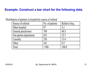
- 31. Example: Construct a bar chart for the following data. Distribution of patients in hospital by source of referral Source of referral No. of patients Relative freq. Other hospital 97 5.1 General practitioner 769 40.3 Out-patient department 623 32.7 Casualty 256 13.4 Other 161 8.5 Total 1 906 100.0 05/04/25 By, Dagnachew M. (MPH) 31
- 32. Distribution of patients in hopital X by source of referal, 1999 97 769 623 256 161 0 100 200 300 400 500 600 700 800 Other hospital GP OPD Casualty Other Source of referal No. of patients 05/04/25 By, Dagnachew M. (MPH) 32
- 33. 2. Sub-divided bar chart • If there are different quantities forming the sub-divisions of the totals, simple bars may be sub-divided in the ratio of the various sub-divisions to exhibit the relationship of the parts to the whole. • The order in which the components are shown in a “bar” is followed in all bars used in the diagram. – Example: Stacked and 100% Component bar charts 05/04/25 By, Dagnachew M. (MPH) 33
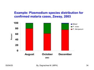
- 34. Example: Plasmodium species distribution for confirmed malaria cases, Zeway, 2003 0 20 40 60 80 100 August October December 2003 P ercent Mixed P. vivax P. falciparum 05/04/25 By, Dagnachew M. (MPH) 34
- 35. 3. Multiple bar graph • Bar charts can be used to represent the relationships among more than two variables. • The following figure shows the relationship between children’s reports of breathlessness and cigarette smoking by themselves and their parents. 05/04/25 By, Dagnachew M. (MPH) 35
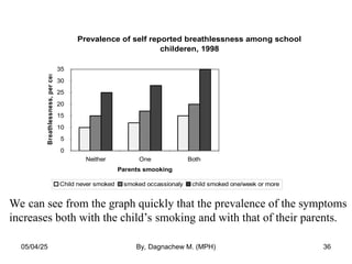
- 36. Prevalence of self reported breathlessness among school childeren, 1998 0 5 10 15 20 25 30 35 Neither One Both Parents smooking Breathlessness, per cent Child never smoked smoked occassionaly child smoked one/week or more We can see from the graph quickly that the prevalence of the symptoms increases both with the child’s smoking and with that of their parents. 05/04/25 By, Dagnachew M. (MPH) 36
- 37. 4. Pie chart • Shows the relative frequency for each category by dividing a circle into sectors, the angles of which are proportional to the relative frequency. • Used for a single categorical variable • Use percentage distributions 05/04/25 By, Dagnachew M. (MPH) 37
- 38. Steps to construct a pie-chart • Construct a frequency table • Change the frequency into percentage (P) • Change the percentages into degrees, where: degree = Percentage X 360o • Draw a circle and divide it accordingly 05/04/25 By, Dagnachew M. (MPH) 38
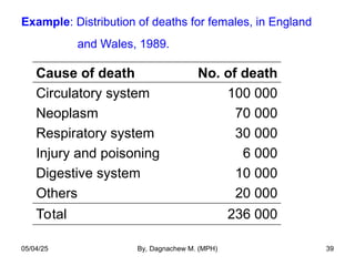
- 39. Example: Distribution of deaths for females, in England and Wales, 1989. Cause of death No. of death Circulatory system Neoplasm Respiratory system Injury and poisoning Digestive system Others 100 000 70 000 30 000 6 000 10 000 20 000 Total 236 000 05/04/25 By, Dagnachew M. (MPH) 39
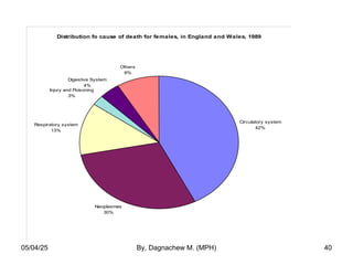
- 40. Distribution fo cause of death for females, in England and Wales, 1989 Circulatory system 42% Neoplasmas 30% Respiratory system 13% Injury and Poisoning 3% Digestive System 4% Others 8% 05/04/25 By, Dagnachew M. (MPH) 40
- 41. 5. Histogram • Histograms are frequency distributions with continuous class intervals that have been turned into graphs. • To construct a histogram, we draw the interval boundaries on a horizontal line and the frequencies on a vertical line. • Non-overlapping intervals that cover all of the data values must be used. 05/04/25 By, Dagnachew M. (MPH) 41
- 42. • Bars are drawn over the intervals in such a way that the areas of the bars are all proportional in the same way to their interval frequencies. • The area of each bar is proportional to the frequency of observations in the interval 05/04/25 By, Dagnachew M. (MPH) 42
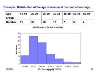
- 43. Example: Distribution of the age of women at the time of marriage Age of women at the time of marriage 0 5 10 15 20 25 30 35 40 14.5-19.5 19.5-24.5 24.5-29.5 29.5-34.5 34.5-39.5 39.5-44.5 44.5-49.5 Age group No of women Age group 15-19 20-24 25-29 30-34 35-39 40-44 45-49 Number 11 36 28 13 7 3 2 05/04/25 By, Dagnachew M. (MPH) 43
- 44. Two problems with histograms 1. They are somewhat difficult to construct 2. The actual values within the respective groups are lost and difficult to reconstruct The other graphic display (stem-and- leaf plot) overcomes these problems 05/04/25 By, Dagnachew M. (MPH) 44
- 45. 6. Stem-and-Leaf Plot • A quick way to organize data to give visual impression similar to a histogram while retaining much more detail on the data. • Similar to histogram and serves the same purpose and reveals the presence or absence of symmetry • Are most effective with relatively small data sets • Are not suitable for reports and other communications, but • Help researchers to understand the nature of their data 05/04/25 By, Dagnachew M. (MPH) 45
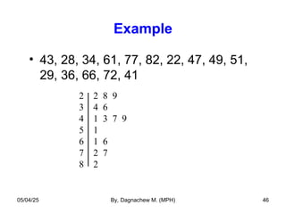
- 46. Example • 43, 28, 34, 61, 77, 82, 22, 47, 49, 51, 29, 36, 66, 72, 41 2 2 8 9 3 4 6 4 1 3 7 9 5 1 6 1 6 7 2 7 8 2 05/04/25 By, Dagnachew M. (MPH) 46
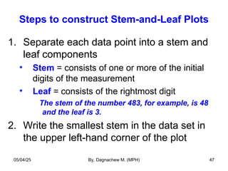
- 47. Steps to construct Stem-and-Leaf Plots 1. Separate each data point into a stem and leaf components • Stem = consists of one or more of the initial digits of the measurement • Leaf = consists of the rightmost digit The stem of the number 483, for example, is 48 and the leaf is 3. 2. Write the smallest stem in the data set in the upper left-hand corner of the plot 05/04/25 By, Dagnachew M. (MPH) 47
- 48. Steps to construct Stem-and-Leaf Plots 3. Write the second stem (first stem +1) below the first stem 4. Continue with the remaining stems until you reach the largest stem in the data set 5. Draw a vertical bar to the right of the column of stems 6. For each number in the data set, find the appropriate stem and write the leaf to the right of the vertical bar 05/04/25 By, Dagnachew M. (MPH) 48
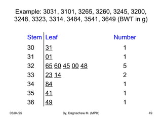
- 49. Example: 3031, 3101, 3265, 3260, 3245, 3200, 3248, 3323, 3314, 3484, 3541, 3649 (BWT in g) Stem Leaf Number 30 31 32 33 34 35 36 31 01 65 60 45 00 48 23 14 84 41 49 1 1 5 2 1 1 1 05/04/25 By, Dagnachew M. (MPH) 49
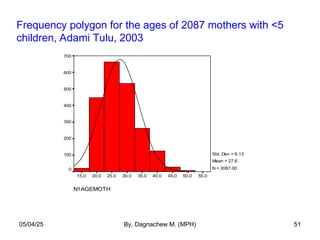
- 50. 7. Frequency polygon • A frequency distribution can be portrayed graphically in yet another way by means of a frequency polygon. • To draw a frequency polygon we connect the mid-point of the tops of the cells of the histogram by a straight line. • The total area under the frequency polygon is equal to the area under the histogram • Useful when comparing two or more frequency distributions by drawing them on the same diagram 05/04/25 By, Dagnachew M. (MPH) 50
- 51. N1AGEMOTH 55.0 50.0 45.0 40.0 35.0 30.0 25.0 20.0 15.0 700 600 500 400 300 200 100 0 Std. Dev = 6.13 Mean = 27.6 N = 2087.00 Frequency polygon for the ages of 2087 mothers with <5 children, Adami Tulu, 2003 05/04/25 By, Dagnachew M. (MPH) 51
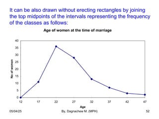
- 52. It can be also drawn without erecting rectangles by joining the top midpoints of the intervals representing the frequency of the classes as follows: Age of women at the time of marriage 0 5 10 15 20 25 30 35 40 12 17 22 27 32 37 42 47 Age No of women 05/04/25 By, Dagnachew M. (MPH) 52
- 53. 8. Ogive Curve (The Cummulative Frequency Polygon) • Some times it may be necessary to know the number of items whose values are more or less than a certain amount. • We may, for example, be interested to know the no. of patients whose weight is <50 Kg or >60 Kg. • To get this information it is necessary to change the form of the frequency distribution from a ‘simple’ to a ‘cumulative’ distribution. • Ogive curve turns a cumulative frequency distribution in to graphs. • Are much more common than frequency polygons 05/04/25 By, Dagnachew M. (MPH) 53
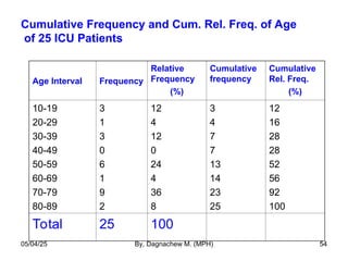
- 54. Cumulative Frequency and Cum. Rel. Freq. of Age of 25 ICU Patients Age Interval Frequency Relative Frequency (%) Cumulative frequency Cumulative Rel. Freq. (%) 10-19 20-29 30-39 40-49 50-59 60-69 70-79 80-89 3 1 3 0 6 1 9 2 12 4 12 0 24 4 36 8 3 4 7 7 13 14 23 25 12 16 28 28 52 56 92 100 Total 25 100 05/04/25 By, Dagnachew M. (MPH) 54
- 55. Cumulative frequency of 25 ICU patients 05/04/25 By, Dagnachew M. (MPH) 55
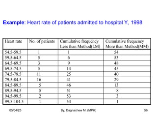
- 56. Example: Heart rate of patients admitted to hospital Y, 1998 Heart rate No. of patients Cumulative frequency Less than Method(LM) Cumulative frequency More than Method(MM) 54.5-59.5 1 1 54 59.5-64.5 5 6 53 64.5-69.5 3 9 48 69.5-74.5 5 14 45 74.5-79.5 11 25 40 79.5-84.5 16 41 29 84.5-89.5 5 46 13 89.5-94.5 5 51 8 94.5-99.5 2 53 3 99.5-104.5 1 54 1 05/04/25 By, Dagnachew M. (MPH) 56
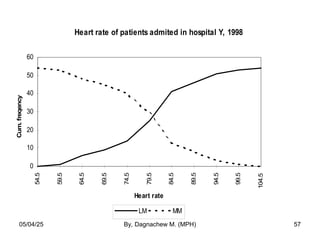
- 57. Heart rate of patients admited in hospital Y, 1998 0 10 20 30 40 50 60 54.5 59.5 64.5 69.5 74.5 79.5 84.5 89.5 94.5 99.5 104.5 Heart rate Cum. freqency LM MM 05/04/25 By, Dagnachew M. (MPH) 57
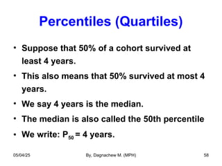
- 58. Percentiles (Quartiles) • Suppose that 50% of a cohort survived at least 4 years. • This also means that 50% survived at most 4 years. • We say 4 years is the median. • The median is also called the 50th percentile • We write: P50 = 4 years. 05/04/25 By, Dagnachew M. (MPH) 58
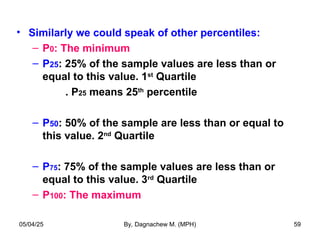
- 59. • Similarly we could speak of other percentiles: – P0: The minimum – P25: 25% of the sample values are less than or equal to this value. 1st Quartile . P25 means 25th percentile – P50: 50% of the sample are less than or equal to this value. 2nd Quartile – P75: 75% of the sample values are less than or equal to this value. 3rd Quartile – P100: The maximum 05/04/25 By, Dagnachew M. (MPH) 59
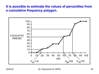
- 60. It is possible to estimate the values of percentiles from a cumulative frequency polygon. 05/04/25 By, Dagnachew M. (MPH) 60
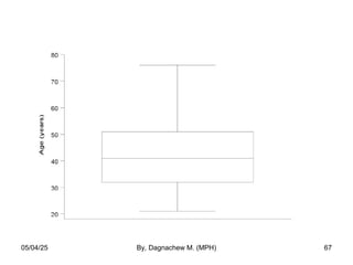
- 61. 9. Box and Whisker Plot • It is another way to display information when the objective is to illustrate certain locations (skewness) in the distribution . • Can be used to display a set of discrete or continuous observations using a single vertical axis – only certain summaries of the data are shown • First the percentiles (or quartiles) of the data set must be defined 05/04/25 By, Dagnachew M. (MPH) 61
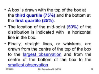
- 62. • A box is drawn with the top of the box at the third quartile (75%) and the bottom at the first quartile (25%). • The location of the mid-point (50%) of the distribution is indicated with a horizontal line in the box. • Finally, straight lines, or whiskers, are drawn from the centre of the top of the box to the largest observation and from the centre of the bottom of the box to the smallest observation. 05/04/25 By, Dagnachew M. (MPH) 62
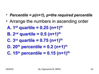
- 63. • Percentile = p(n+1), p=the required percentile • Arrange the numbers in ascending order A. 1st quartile = 0.25 (n+1)th B. 2nd quartile = 0.5 (n+1)th C. 3rd quartile = 0.75 (n+1)th D. 20th percentile = 0.2 (n+1)th C. 15th percentile = 0.15 (n+1)th 05/04/25 By, Dagnachew M. (MPH) 63
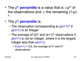
- 64. • The pth percentile is a value that is p% of the observations and the remaining (1-p) % . • The pth percentile is: – The observation corresponding to p(n+1)th if p(n+1) is an integer – The average of (k)th and (k+1)th observations if p(n+1) is not an integer, where k is the largest integer less than p(n+1). • If p(n+1) = 3.6, the average of 3th and 4th observations 05/04/25 By, Dagnachew M. (MPH) 64
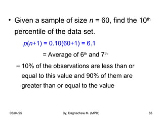
- 65. • Given a sample of size n = 60, find the 10th percentile of the data set. p(n+1) = 0.10(60+1) = 6.1 = Average of 6th and 7th – 10% of the observations are less than or equal to this value and 90% of them are greater than or equal to the value 05/04/25 By, Dagnachew M. (MPH) 65
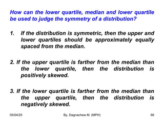
- 66. How can the lower quartile, median and lower quartile be used to judge the symmetry of a distribution? 1. If the distribution is symmetric, then the upper and lower quartiles should be approximately equally spaced from the median. 2. If the upper quartile is farther from the median than the lower quartile, then the distribution is positively skewed. 3. If the lower quartile is farther from the median than the upper quartile, then the distribution is negatively skewed. 05/04/25 By, Dagnachew M. (MPH) 66
- 67. 05/04/25 By, Dagnachew M. (MPH) 67
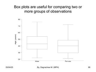
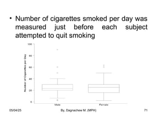
- 68. Box plots are useful for comparing two or more groups of observations 05/04/25 By, Dagnachew M. (MPH) 68
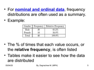
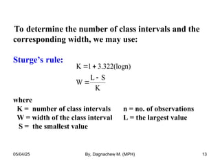
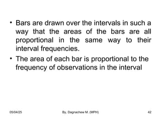
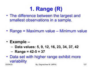
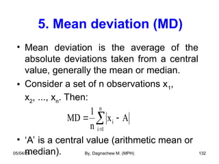
- 69. Outlying values • The lines coming out of the box are called the “whiskers”. • The ends of the “whiskers’ are called “adjacent values) [The largest and smallest non-outlying values]. • Upper “adjacent value” = The largest value that is less than or equal to P75 + 1.5*(P75 – P25). • Lower “adjacent value” = The smallest value that is greater than or equal to P25 – 1.5*(P75 – P25). 05/04/25 By, Dagnachew M. (MPH) 69
- 70. • The box plot is then completed: – Draw a vertical bar from the upper quartile to the largest non-outlining value in the sample – Draw a vertical bar from the lower quartile to the smallest non-outlying value in the sample – Outliers are displayed as dots (or small circles) and are defined by: Values greater than 75th percentile + 1.5*IQR Values smaller than 25th percentile − 1.5*IQR – Any values that are outside the IQR but are not outliers are marked by the whiskers on the plot. – IQR = P75 – P25 05/04/25 By, Dagnachew M. (MPH) 70
- 71. • Number of cigarettes smoked per day was measured just before each subject attempted to quit smoking 05/04/25 By, Dagnachew M. (MPH) 71
- 72. 10. Scatter plot • Most studies in medicine involve measuring more than one characteristic, and graphs displaying the relationship between two characteristics are common in literature. • When both the variables are qualitative then we can use a multiple bar graph. • When one of the characteristics is qualitative and the other is quantitative, the data can be displayed in box and whisker plots. 05/04/25 By, Dagnachew M. (MPH) 72
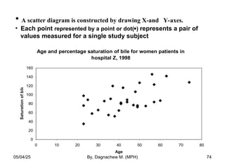
- 73. • For two quantitative variables we use bivariate plots (also called scatter plots or scatter diagrams). • In the study on percentage saturation of bile, information was collected on the age of each patient to see whether a relationship existed between the two measures. 05/04/25 By, Dagnachew M. (MPH) 73
- 74. • A scatter diagram is constructed by drawing X-and Y-axes. • Each point represented by a point or dot() represents a pair of values measured for a single study subject Age and percentage saturation of bile for women patients in hospital Z, 1998 0 20 40 60 80 100 120 140 160 0 10 20 30 40 50 60 70 80 Age Saturation of bile 05/04/25 By, Dagnachew M. (MPH) 74
- 75. • The graph suggests the possibility of a positive relationship between age and percentage saturation of bile in women. 05/04/25 By, Dagnachew M. (MPH) 75
- 76. 11. Line graph • Useful for assessing the trend of particular situation overtime. • Helps for monitoring the trend of epidemics. • The time, in weeks, months or years, is marked along the horizontal axis, and • Values of the quantity being studied is marked on the vertical axis. • Values for each category are connected by continuous line. • Sometimes two or more graphs are drawn on the same graph taking the same scale so that the plotted graphs are comparable. 05/04/25 By, Dagnachew M. (MPH) 76
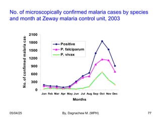
- 77. No. of microscopically confirmed malaria cases by species and month at Zeway malaria control unit, 2003 0 300 600 900 1200 1500 1800 2100 Jan Feb Mar Apr May Jun Jul Aug Sep Oct Nov Dec Months No. of confirmed malaria cases Positive P. falciparum P. vivax 05/04/25 By, Dagnachew M. (MPH) 77
- 78. Line graph can be also used to depict the relationship between two continuous variables like that of scatter diagram. • The following graph shows level of zidovudine (AZT) in the blood of AIDS patients at several times after administration of the drug, with normal fat absorption and with fat mal absorption. 05/04/25 By, Dagnachew M. (MPH) 78
- 79. Response to administration of zidovudine in two groups of AIDS patients in hospital X, 1999 0 1 2 3 4 5 6 7 8 10 20 70 80 100 120 170 190 250 300 360 Time since administration (Min.) Blood zidovudine concentration Fat malabsorption Normal fat absorption 05/04/25 By, Dagnachew M. (MPH) 79
- 80. Descriptive Statistics: Numerical Summary Measures – Single numbers which quantify the characteristics of a distribution of values Measures of central tendency (location) Measures of dispersion 05/04/25 By, Dagnachew M. (MPH) 80
- 81. • A frequency distribution is a general picture of the distribution of a variable • But, can’t indicate the average value and the spread of the values 05/04/25 By, Dagnachew M. (MPH) 81
- 82. Measures of Central Tendency (MCT) • On the scale of values of a variable there is a certain stage at which the largest number of items tend to cluster. • Since this stage is usually in the centre of distribution, the tendency of the statistical data to get concentrated at a certain value is called “central tendency” • The various methods of determining the point about which the observations tend to concentrate are called MCT. 05/04/25 By, Dagnachew M. (MPH) 82
- 83. • The objective of calculating MCT is to determine a single figure which may be used to represent the whole data set. • In that sense it is an even more compact description of the statistical data than the frequency distribution. • Since a MCT represents the entire data, it facilitates comparison within one group or between groups of data. 05/04/25 By, Dagnachew M. (MPH) 83
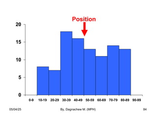
- 84. 0 5 10 15 20 0-9 10-19 20-29 30-39 40-49 50-59 60-69 70-79 80-89 90-99 Position 05/04/25 By, Dagnachew M. (MPH) 84
- 85. Characteristics of a good MCT A MCT is good or satisfactory if it possesses the following characteristics. 1. It should be based on all the observations 2. It should not be affected by the extreme values 3. It should be as close to the maximum number of values as possible 4. It should have a definite value 5. It should not be subjected to complicated and tedious calculations 6. It should be capable of further algebraic treatment 7. It should be stable with regard to sampling 05/04/25 By, Dagnachew M. (MPH) 85
- 86. • The most common measures of central tendency include: – Arithmetic Mean – Median – Mode 05/04/25 By, Dagnachew M. (MPH) 86
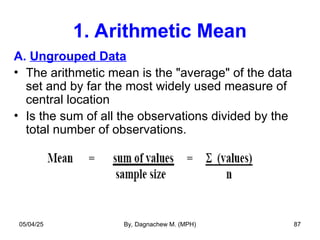
- 87. 1. Arithmetic Mean A. Ungrouped Data • The arithmetic mean is the "average" of the data set and by far the most widely used measure of central location • Is the sum of all the observations divided by the total number of observations. 05/04/25 By, Dagnachew M. (MPH) 87
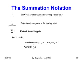
- 88. The Summation Notation 05/04/25 By, Dagnachew M. (MPH) 88
- 89. 05/04/25 By, Dagnachew M. (MPH) 89
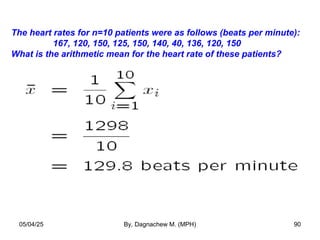
- 90. The heart rates for n=10 patients were as follows (beats per minute): 167, 120, 150, 125, 150, 140, 40, 136, 120, 150 What is the arithmetic mean for the heart rate of these patients? 05/04/25 By, Dagnachew M. (MPH) 90
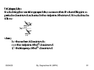
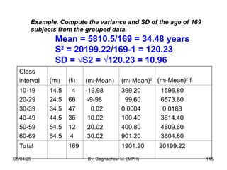
- 92. Example. Compute the mean age of 169 subjects from the grouped data. Mean = 5810.5/169 = 34.48 years Class interval Mid-point (mi) Frequency (fi) mifi 10-19 20-29 30-39 40-49 50-59 60-69 14.5 24.5 34.5 44.5 54.5 64.5 4 66 47 36 12 4 58.0 1617.0 1621.5 1602.0 654.0 258.0 Total __ 169 5810.5 05/04/25 By, Dagnachew M. (MPH) 92
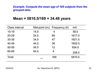
- 93. The mean can be thought of as a “balancing point”, “center of gravity” 05/04/25 By, Dagnachew M. (MPH) 93
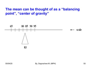
- 94. When the data are skewed, the mean is “dragged” in the direction of the skewness • It is possible in extreme cases for all but one of the sample points to be on one side of the arithmetic mean & in this case, the mean is a poor measure of central location or does not reflect the center of the sample. 05/04/25 By, Dagnachew M. (MPH) 94
- 95. Properties of the Arithmetic Mean. • For a given set of data there is one and only one arithmetic mean (uniqueness). • Easy to calculate and understand (simple). • Influenced by each and every value in a data set • Greatly affected by the extreme values. • In case of grouped data if any class interval is open, arithmetic mean can not be calculated. 05/04/25 By, Dagnachew M. (MPH) 95
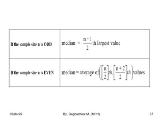
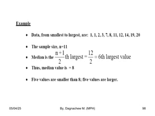
- 96. 2. Median a) Ungrouped data • The median is the value which divides the data set into two equal parts. • If the number of values is odd, the median will be the middle value when all values are arranged in order of magnitude. • When the number of observations is even, there is no single middle value but two middle observations. • In this case the median is the mean of these two middle observations, when all observations have been arranged in the order of their magnitude. 05/04/25 By, Dagnachew M. (MPH) 96
- 97. 05/04/25 By, Dagnachew M. (MPH) 97
- 98. 05/04/25 By, Dagnachew M. (MPH) 98
- 99. 05/04/25 By, Dagnachew M. (MPH) 99
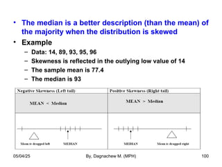
- 100. • The median is a better description (than the mean) of the majority when the distribution is skewed • Example – Data: 14, 89, 93, 95, 96 – Skewness is reflected in the outlying low value of 14 – The sample mean is 77.4 – The median is 93 05/04/25 By, Dagnachew M. (MPH) 100
- 101. b) Grouped data • In calculating the median from grouped data, we assume that the values within a class- interval are evenly distributed through the interval. • The first step is to locate the class interval in which the median is located, using the following procedure. • Find n/2 and see a class interval with a minimum cumulative frequency which contains n/2. • Then, use the following formula. 05/04/25 By, Dagnachew M. (MPH) 101
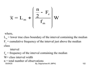
- 102. ~ x = L n 2 F f W m c m where, Lm = lower true class boundary of the interval containing the median Fc = cumulative frequency of the interval just above the median class interval fm = frequency of the interval containing the median W= class interval width n = total number of observations 05/04/25 By, Dagnachew M. (MPH) 102
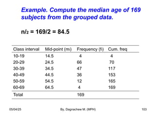
- 103. Example. Compute the median age of 169 subjects from the grouped data. n/2 = 169/2 = 84.5 Class interval Mid-point (mi) Frequency (fi) Cum. freq 10-19 20-29 30-39 40-49 50-59 60-69 14.5 24.5 34.5 44.5 54.5 64.5 4 66 47 36 12 4 4 70 117 153 165 169 Total 169 05/04/25 By, Dagnachew M. (MPH) 103
- 104. • n/2 = 84.5 = in the 3rd class interval • Lower limit = 29.5, Upper limit = 39.5 • Frequency of the class = 47 • (n/2 – fc) = 84.5-70 = 14.5 • Median = 29.5 + (14.5/47)10 = 32.58 ≈ 33 05/04/25 By, Dagnachew M. (MPH) 104
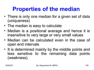
- 105. Properties of the median • There is only one median for a given set of data (uniqueness) • The median is easy to calculate • Median is a positional average and hence it is insensitive to very large or very small values • Median can be calculated even in the case of open end intervals • It is determined mainly by the middle points and less sensitive to the remaining data points (weakness). 05/04/25 By, Dagnachew M. (MPH) 105
- 106. Quartiles • Just as the median is the value above and below which lie half the set of data, one can define measures (above or below) which lie other fractional parts of the data. • The median divides the data into two equal parts • If the data are divided into four equal parts, we speak of quartiles. 05/04/25 By, Dagnachew M. (MPH) 106
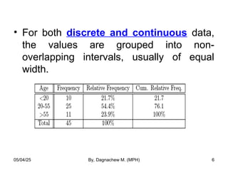
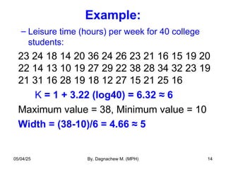
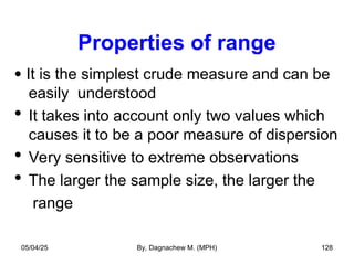
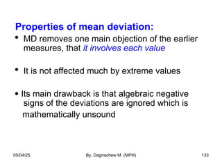
- 107. quartile Q1 = [(n+1)/4]th Q2 = [2(n+1)/4]th Q3 = [3(n+1)/4]th 05/04/25 By, Dagnachew M. (MPH) 107
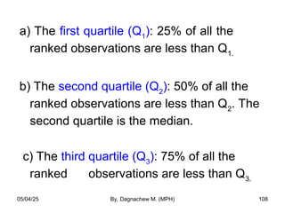
- 108. a) The first quartile (Q1 ): 25% of all the ranked observations are less than Q1. b) The second quartile (Q2 ): 50% of all the ranked observations are less than Q2 . The second quartile is the median. c) The third quartile (Q3 ): 75% of all the ranked observations are less than Q3. 05/04/25 By, Dagnachew M. (MPH) 108
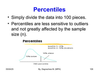
- 109. Percentiles • Simply divide the data into 100 pieces. • Percentiles are less sensitive to outliers and not greatly affected by the sample size (n). 05/04/25 By, Dagnachew M. (MPH) 109
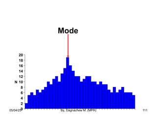
- 110. 3. Mode • The mode is the most frequently occurring value among all the observations in a set of data. • It is not influenced by extreme values. • It is possible to have more than one mode or no mode. • It is not a good summary of the majority of the data. 05/04/25 By, Dagnachew M. (MPH) 110
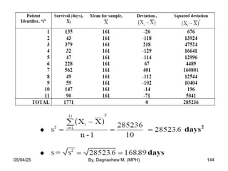
- 111. Mode 0 2 4 6 8 10 12 14 16 18 20 N Mode T. Ancelle, D. Coulombie Mode 05/04/25 By, Dagnachew M. (MPH) 111
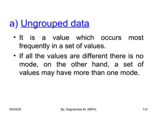
- 112. • It is a value which occurs most frequently in a set of values. • If all the values are different there is no mode, on the other hand, a set of values may have more than one mode. a) Ungrouped data 05/04/25 By, Dagnachew M. (MPH) 112
- 113. • Example • Data are: 1, 2, 3, 4, 4, 4, 4, 5, 5, 6 • Mode is 4 “Unimodal” • Example • Data are: 1, 2, 2, 2, 3, 4, 5, 5, 5, 6, 6, 8 • There are two modes – 2 & 5 • This distribution is said to be “bi-modal” • Example • Data are: 2.62, 2.75, 2.76, 2.86, 3.05, 3.12 • No mode, since all the values are different 05/04/25 By, Dagnachew M. (MPH) 113
- 114. b) Grouped data • To find the mode of grouped data, we usually refer to the modal class, where the modal class is the class interval with the highest frequency. • If a single value for the mode of grouped data must be specified, it is taken as the mid-point of the modal class interval. 05/04/25 By, Dagnachew M. (MPH) 114
- 115. 05/04/25 By, Dagnachew M. (MPH) 115
- 116. Properties of mode It is not affected by extreme values It can be calculated for distributions with open end classes Often its value is not unique The main drawback of mode is that often it does not exist 05/04/25 By, Dagnachew M. (MPH) 116
- 117. Which measure of central tendency is best with a given set of data? • Two factors are important in making this decisions: – The scale of measurement (type of data) – The shape of the distribution of the observations 05/04/25 By, Dagnachew M. (MPH) 117
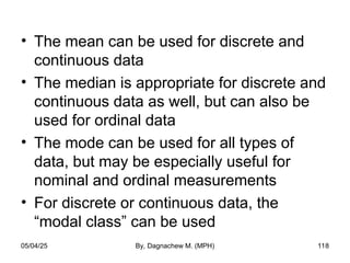
- 118. • The mean can be used for discrete and continuous data • The median is appropriate for discrete and continuous data as well, but can also be used for ordinal data • The mode can be used for all types of data, but may be especially useful for nominal and ordinal measurements • For discrete or continuous data, the “modal class” can be used 05/04/25 By, Dagnachew M. (MPH) 118
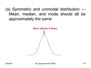
- 119. (a) Symmetric and unimodal distribution — Mean, median, and mode should all be approximately the same Mean, Median & Mode 05/04/25 By, Dagnachew M. (MPH) 119
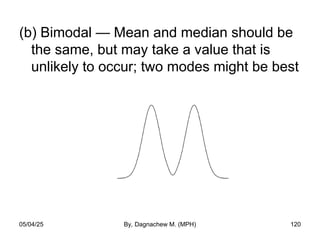
- 120. (b) Bimodal — Mean and median should be the same, but may take a value that is unlikely to occur; two modes might be best 05/04/25 By, Dagnachew M. (MPH) 120
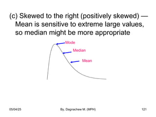
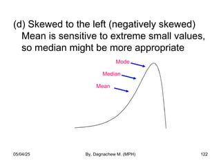
- 121. (c) Skewed to the right (positively skewed) — Mean is sensitive to extreme large values, so median might be more appropriate Mode Median Mean 05/04/25 By, Dagnachew M. (MPH) 121
- 122. (d) Skewed to the left (negatively skewed) Mean is sensitive to extreme small values, so median might be more appropriate Mode Median 05/04/25 By, Dagnachew M. (MPH) 122 Mean
- 123. Measures of Dispersion Consider the following two sets of data: A: 177 193 195 209 226 Mean = 200 B: 192 197 200 202 209 Mean = 200 Two or more sets may have the same mean and/or median but they may be quite different. 05/04/25 By, Dagnachew M. (MPH) 123
- 124. • MCT are not enough to give a clear understanding about the distribution of the data. • We need to know something about the variability or spread of the values — whether they tend to be clustered close together, or spread out over a broad range 05/04/25 By, Dagnachew M. (MPH) 124
- 125. Measures of Dispersion • Measures that quantify the variation or dispersion of a set of data from its central location • Dispersion refers to the variety exhibited by the values of the data. • The amount may be small when the values are close together. • If all the values are the same, no dispersion 05/04/25 By, Dagnachew M. (MPH) 125
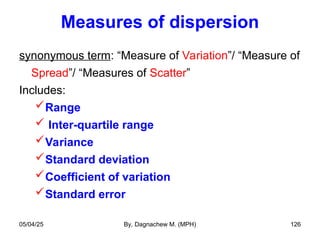
- 126. Measures of dispersion synonymous term: “Measure of Variation”/ “Measure of Spread”/ “Measures of Scatter” Includes: Range Inter-quartile range Variance Standard deviation Coefficient of variation Standard error 05/04/25 By, Dagnachew M. (MPH) 126
- 127. 1. Range (R) • The difference between the largest and smallest observations in a sample. • Range = Maximum value – Minimum value • Example – – Data values: 5, 9, 12, 16, 23, 34, 37, 42 – Range = 42-5 = 37 • Data set with higher range exhibit more variability 05/04/25 By, Dagnachew M. (MPH) 127
- 128. Properties of range It is the simplest crude measure and can be easily understood It takes into account only two values which causes it to be a poor measure of dispersion Very sensitive to extreme observations The larger the sample size, the larger the range 05/04/25 By, Dagnachew M. (MPH) 128
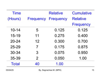
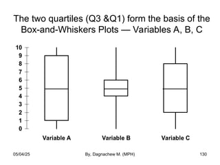
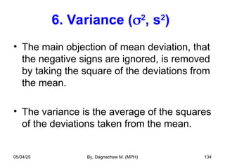
- 129. 2. Interquartile range (IQR) • Indicates the spread of the middle 50% of the observations, and used with median IQR = Q3 - Q1… Where Q1 = [(n+1)/4]th Q2 = [2(n+1)/4]th Q3 = [3(n+1)/4]th • Example: Suppose the first and third quartile for weights of girls 12 months of age are 8.8 Kg and 10.2 Kg, respectively. IQR = 10.2 Kg – 8.8 Kg i.e. the inner 50% of the infant girls weigh between 8.8 and 10.2 Kg. 05/04/25 By, Dagnachew M. (MPH) 129
- 130. The two quartiles (Q3 &Q1) form the basis of the Box-and-Whiskers Plots — Variables A, B, C 0 1 2 3 4 5 6 7 8 9 10 Variable A Variable B Variable C 05/04/25 By, Dagnachew M. (MPH) 130
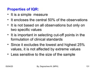
- 131. Properties of IQR: • It is a simple measure • It encloses the central 50% of the observations • It is not based on all observations but only on two specific values • It is important in selecting cut-off points in the formulation of clinical standards • Since it excludes the lowest and highest 25% values, it is not affected by extreme values • Less sensitive to the size of the sample 05/04/25 By, Dagnachew M. (MPH) 131
- 132. 5. Mean deviation (MD) • Mean deviation is the average of the absolute deviations taken from a central value, generally the mean or median. • Consider a set of n observations x1 , x2 , ..., xn . Then: • ‘A’ is a central value (arithmetic mean or median). MD 1 n x A i i 1 n 05/04/25 By, Dagnachew M. (MPH) 132
- 133. Properties of mean deviation: MD removes one main objection of the earlier measures, that it involves each value It is not affected much by extreme values Its main drawback is that algebraic negative signs of the deviations are ignored which is mathematically unsound 05/04/25 By, Dagnachew M. (MPH) 133
- 134. 6. Variance (2 , s2 ) • The main objection of mean deviation, that the negative signs are ignored, is removed by taking the square of the deviations from the mean. • The variance is the average of the squares of the deviations taken from the mean. 05/04/25 By, Dagnachew M. (MPH) 134
- 135. • It is squared because the sum of the deviations of the individual observations of a sample about the sample mean is always 0 0 = ( ) • The variance can be thought of as an average of squared deviations - x x i 05/04/25 By, Dagnachew M. (MPH) 135
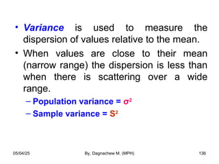
- 136. • Variance is used to measure the dispersion of values relative to the mean. • When values are close to their mean (narrow range) the dispersion is less than when there is scattering over a wide range. – Population variance = σ2 – Sample variance = S2 05/04/25 By, Dagnachew M. (MPH) 136
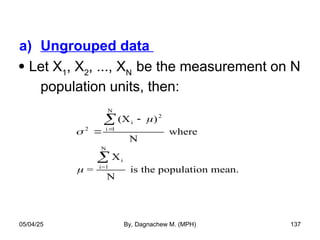
- 137. a) Ungrouped data Let X1 , X2 , ..., XN be the measurement on N population units, then: 2 i 2 i 1 N i i=1 N (X ) N where = X N is the population mean. 05/04/25 By, Dagnachew M. (MPH) 137
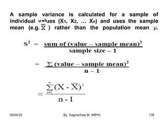
- 138. A sample variance is calculated for a sample of individual values (X1, X2, … Xn) and uses the sample mean (e.g. ) rather than the population mean µ. 05/04/25 By, Dagnachew M. (MPH) 138
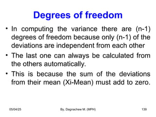
- 139. Degrees of freedom • In computing the variance there are (n-1) degrees of freedom because only (n-1) of the deviations are independent from each other • The last one can always be calculated from the others automatically. • This is because the sum of the deviations from their mean (Xi-Mean) must add to zero. 05/04/25 By, Dagnachew M. (MPH) 139
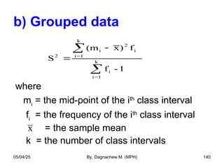
- 140. b) Grouped data where mi = the mid-point of the ith class interval fi = the frequency of the ith class interval = the sample mean k = the number of class intervals S (m x) f f - 1 2 i 2 i i=1 k i i=1 k x 05/04/25 By, Dagnachew M. (MPH) 140
- 141. Properties of Variance: The main disadvantage of variance is that its unit is the square of the unite of the original measurement values The variance gives more weight to the extreme values as compared to those which are near to mean value, because the difference is squared in variance. • The drawbacks of variance are overcome by the standard deviation. 05/04/25 By, Dagnachew M. (MPH) 141
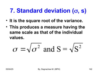
- 142. 7. Standard deviation (, s) • It is the square root of the variance. • This produces a measure having the same scale as that of the individual values. 2 and S = S2 05/04/25 By, Dagnachew M. (MPH) 142
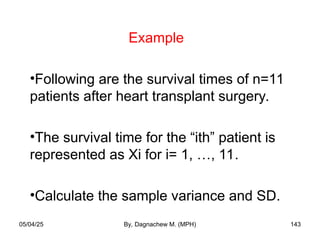
- 143. Example •Following are the survival times of n=11 patients after heart transplant surgery. •The survival time for the “ith” patient is represented as Xi for i= 1, …, 11. •Calculate the sample variance and SD. 05/04/25 By, Dagnachew M. (MPH) 143
- 144. 05/04/25 By, Dagnachew M. (MPH) 144
- 145. Example. Compute the variance and SD of the age of 169 subjects from the grouped data. Mean = 5810.5/169 = 34.48 years S2 = 20199.22/169-1 = 120.23 SD = √S2 = √120.23 = 10.96 Class interval (mi) (fi) (mi-Mean) (mi-Mean)2 (mi-Mean)2 fi 10-19 20-29 30-39 40-49 50-59 60-69 14.5 24.5 34.5 44.5 54.5 64.5 4 66 47 36 12 4 -19.98 -9-98 0.02 10.02 20.02 30.02 399.20 99.60 0.0004 100.40 400.80 901.20 1596.80 6573.60 0.0188 3614.40 4809.60 3604.80 Total 169 1901.20 20199.22 05/04/25 By, Dagnachew M. (MPH) 145
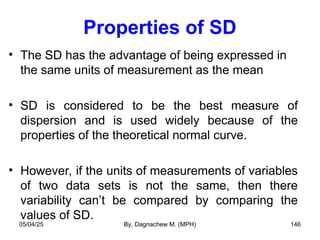
- 146. Properties of SD • The SD has the advantage of being expressed in the same units of measurement as the mean • SD is considered to be the best measure of dispersion and is used widely because of the properties of the theoretical normal curve. • However, if the units of measurements of variables of two data sets is not the same, then there variability can’t be compared by comparing the values of SD. 05/04/25 By, Dagnachew M. (MPH) 146
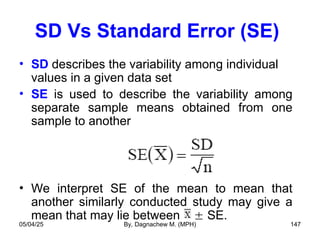
- 147. SD Vs Standard Error (SE) • SD describes the variability among individual values in a given data set • SE is used to describe the variability among separate sample means obtained from one sample to another • We interpret SE of the mean to mean that another similarly conducted study may give a mean that may lie between SE. 05/04/25 By, Dagnachew M. (MPH) 147
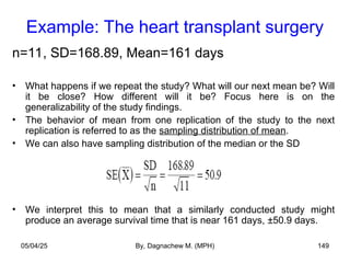
- 148. Standard Error • SD is about the variability of individuals • SE is used to describe the variability in the means of repeated samples taken from the same population. • For example, imagine 5,000 samples, each of the same size n=11. This would produce 5,000 sample means. This new collection has its own pattern of variability. We describe this new pattern of variability using the SE, not the SD. 05/04/25 By, Dagnachew M. (MPH) 148
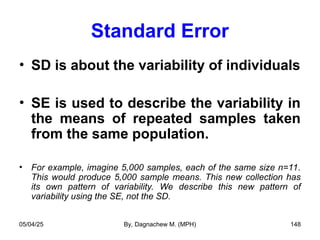
- 149. Example: The heart transplant surgery n=11, SD=168.89, Mean=161 days • What happens if we repeat the study? What will our next mean be? Will it be close? How different will it be? Focus here is on the generalizability of the study findings. • The behavior of mean from one replication of the study to the next replication is referred to as the sampling distribution of mean. • We can also have sampling distribution of the median or the SD • We interpret this to mean that a similarly conducted study might produce an average survival time that is near 161 days, ±50.9 days. 05/04/25 By, Dagnachew M. (MPH) 149
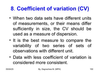
- 150. 8. Coefficient of variation (CV) • When two data sets have different units of measurements, or their means differ sufficiently in size, the CV should be used as a measure of dispersion. • It is the best measure to compare the variability of two series of sets of observations with different unit. • Data with less coefficient of variation is considered more consistent. 05/04/25 By, Dagnachew M. (MPH) 150
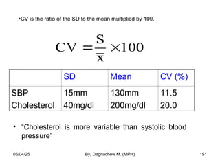
- 151. CV S x 100 • “Cholesterol is more variable than systolic blood pressure” SD Mean CV (%) SBP Cholesterol 15mm 40mg/dl 130mm 200mg/dl 11.5 20.0 •CV is the ratio of the SD to the mean multiplied by 100. 05/04/25 By, Dagnachew M. (MPH) 151
- 152. NOTE: • The range often appears with the median as a numerical summary measure • The IQR is used with the median as well • The SD is used with the mean • For nominal and ordinal data, a table or graph is often more effective than any numerical summary measure 05/04/25 By, Dagnachew M. (MPH) 152
Editor's Notes
- #12: Grouped Data – Frequency Distribution To group a set of observations we select a contiguous, non-overlapping intervals such that each value in the set of observations can be placed in one and only one, of the intervals. A common rule of thumb states that there should be no fewer than six intervals and no more than 15.
- #19: Only one variable
- #20: Two variable table
- #37: Instead of “stacks” rising up from the horizontal (bar chart), we could plot instead the shares of a pie. Recalling that a circle has 360 degrees, that 50% means 180 degrees, 25% means 90 degrees, etc, we can identify “wedges” according to relative frequency
- #42: Note that the area, rather than the height, is proportional to the frequency. If the length of each group interval is the same, then the area and the height are in the same proportions and the height will be proportional to the frequency as well. However, if one group interval is 5 times as long as another and the two group intervals have the same frequency, then the first group interval should have a height 1/5 as high as the second group interval so that the areas will be the same.
- #48: The stems are separated from their leaves by a vertical line. Decimals when present in the original data are omitted in the stem-and-leaf display OR a multiplication factor (m) is given in the bottom of the display to allow for the representation of decimal numbers. In this case, the actual value of the number is assumed to be stem.leaf X 10m. For example, if the multiplication factor is 101, the value 6 4 on the stem-and –leaf plot represents the number 6.4X101 = 64.
- #49: The pairs of digits to the right (leaf) of the vertical bar would be underlined when the number of stem become >2 digits.
- #123: They appear to have about the same center. The difference lies in the greater variability or spread.
- #126: To quantify the spread or variation in the data we use measures of spread. So measures of spread are measures that quantify the variation or dispersion of a set of data from its central location. They are also known as “measures of dispersion or “measures of variation”. Some common measures of spread are: Range Interquartile range Variance / standard deviation Standard error 95% confidence interval
- #127: The range is the simplest measure of dispersion. It is, simply, the difference between the largest and smallest values.
- #128: The larger n is, the larger the ranges tend to be. This complication makes it difficult to compare ranges from different-size data sets.
- #130: [Consider skipping or deleting the Interquartile Range slides - rcd] Here are the box-and-whiskers diagrams for Variables A, B, and C. You can see that Variable B had the narrowest interquartile range, because the numbers tended to be bunch in the middle. Variables A and C were more spread out.
- #132: The mean deviation is a reasonable measure of spread, but does not characterize the spread as well as the standard deviation if the underlying distribution is bell-shaped.
- #135: Variance (s2) describes the amount of overall variability around the mean (in all directions) and is measured as the average of the squared distances between each variable and the mean. The sum of the deviations from the mean is always zero, and this does not summarize the difference between the individuals sample points and the arithmetic mean.
- #139: In computing the variance, we say that we have n-1 degrees of freedom. Because the sum of the deviations of the values from their mean is equal to zero. If, then, we know the values of n-1 of the deviations from the mean, we know the nth one, since it is automatically determined because of the necessity for all n values to add to zero. All n of them must add up to zero. Only (n-1) of the deviations from (Xi-Mean) are independent from each other.
- #142: Standard deviation (s) is calculated as the positive square root of the variance: . Because standard deviation describes the variability of the data in one direction only, it has the same units of measurement as the mean; hence, it is used more frequently than the variance to describe the breadth of the data.
- #146: The mean and the SD are the most widely used measures of location and spread in the literature. The normal distribution is defined explicitly in terms of these two parameters.