Introduction to business statistics

This document provides an introduction to statistics and its uses in business. It outlines two main branches of statistics - descriptive statistics which involves collecting, summarizing and presenting data, and inferential statistics which uses data from a sample to draw conclusions about a larger population. The document then discusses key statistical concepts like variables, data, populations, samples, parameters and statistics. It explains how descriptive and inferential statistics are used to summarize data, draw conclusions, make forecasts and improve business processes. Finally, it introduces the DCOVA process for examining and concluding from data which involves defining variables, collecting data, organizing data, visualizing data and analyzing data.

Introduction to business statistics
- 1. Introduction Copyright ©2011 Pearson Education 1-1
- 2. Learning Objectives In this chapter you learn: How business uses statistics The basic vocabulary of statistics How to use Microsoft Excel with this book Copyright ©2011 Pearson Education 1-2
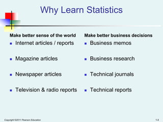
- 3. Why Learn Statistics Make better sense of the world Make better business decisions Internet articles / reports Business memos Magazine articles Business research Newspaper articles Technical journals Television & radio reports Technical reports Copyright ©2011 Pearson Education 1-3
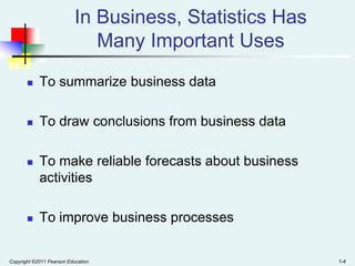
- 4. In Business, Statistics Has Many Important Uses To summarize business data To draw conclusions from business data To make reliable forecasts about business activities To improve business processes Copyright ©2011 Pearson Education 1-4
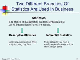
- 5. Two Different Branches Of Statistics Are Used In Business Statistics The branch of mathematics that transforms data into useful information for decision makers. Descriptive Statistics Inferential Statistics Collecting, summarizing, prese nting and analyzing data Using data collected from a small group to draw conclusions about a larger group Copyright ©2011 Pearson Education 1-5
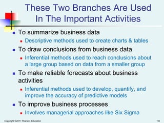
- 6. These Two Branches Are Used In The Important Activities To summarize business data To draw conclusions from business data Inferential methods used to reach conclusions about a large group based on data from a smaller group To make reliable forecasts about business activities Descriptive methods used to create charts & tables Inferential methods used to develop, quantify, and improve the accuracy of predictive models To improve business processes Involves managerial approaches like Six Sigma Copyright ©2011 Pearson Education 1-6
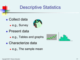
- 7. Descriptive Statistics Collect data Present data e.g., Survey e.g., Tables and graphs Characterize data e.g., The sample mean Copyright ©2011 Pearson Education 1-7
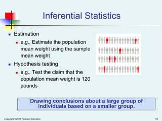
- 8. Inferential Statistics Estimation e.g., Estimate the population mean weight using the sample mean weight Hypothesis testing e.g., Test the claim that the population mean weight is 120 pounds Drawing conclusions about a large group of individuals based on a smaller group. Copyright ©2011 Pearson Education 1-8
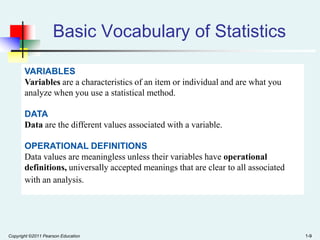
- 9. Basic Vocabulary of Statistics VARIABLES Variables are a characteristics of an item or individual and are what you analyze when you use a statistical method. DATA Data are the different values associated with a variable. OPERATIONAL DEFINITIONS Data values are meaningless unless their variables have operational definitions, universally accepted meanings that are clear to all associated with an analysis. Copyright ©2011 Pearson Education 1-9
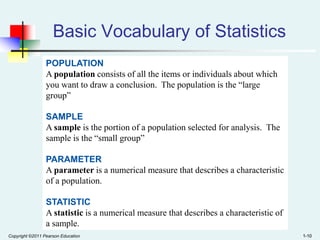
- 10. Basic Vocabulary of Statistics POPULATION A population consists of all the items or individuals about which you want to draw a conclusion. The population is the “large group” SAMPLE A sample is the portion of a population selected for analysis. The sample is the “small group” PARAMETER A parameter is a numerical measure that describes a characteristic of a population. STATISTIC A statistic is a numerical measure that describes a characteristic of a sample. Copyright ©2011 Pearson Education 1-10
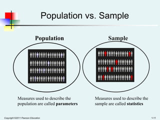
- 11. Population vs. Sample Population Measures used to describe the population are called parameters Copyright ©2011 Pearson Education Sample Measures used to describe the sample are called statistics 1-11
- 12. Chapter Summary In this chapter, we have Introduced the basic vocabulary of statistics and the role of statistics in turning data into information to facilitate decision making Examined the use of statistics to: Summarize data Draw conclusions from data Make reliable forecasts Improve business processes Examined descriptive vs. inferential statistics Copyright ©2011 Pearson Education 1-12
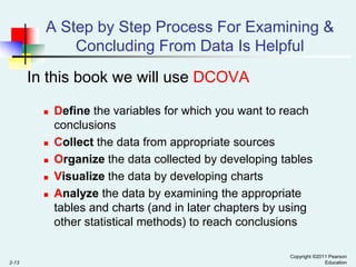
- 13. A Step by Step Process For Examining & Concluding From Data Is Helpful In this book we will use DCOVA 2-13 Define the variables for which you want to reach conclusions Collect the data from appropriate sources Organize the data collected by developing tables Visualize the data by developing charts Analyze the data by examining the appropriate tables and charts (and in later chapters by using other statistical methods) to reach conclusions Copyright ©2011 Pearson Education
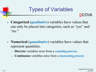
- 14. Types of Variables DCOVA Categorical (qualitative) variables have values that can only be placed into categories, such as “yes” and “no.” Numerical (quantitative) variables have values that represent quantities. 2-14 Discrete variables arise from a counting process Continuous variables arise from a measuring process Copyright ©2011 Pearson Education
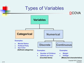
- 15. Types of Variables DCOVA Variables Categorical Numerical Examples: Marital Status Political Party Eye Color (Defined categories) Discrete Examples: 2-15 Number of Children Defects per hour (Counted items) Continuous Examples: Weight Voltage (Measured characteristics) Copyright ©2011 Pearson Education
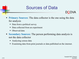
- 16. Sources of Data DCOVA Primary Sources: The data collector is the one using the data for analysis Data from a political survey Data collected from an experiment Observed data Secondary Sources: The person performing data analysis is not the data collector Analyzing census data Examining data from print journals or data published on the internet. 2-16 Copyright ©2011 Pearson Education
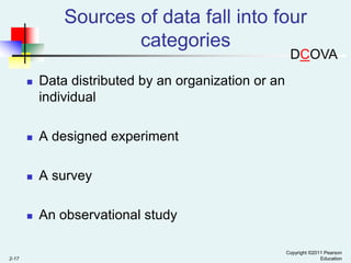
- 17. Sources of data fall into four categories DCOVA A designed experiment A survey 2-17 Data distributed by an organization or an individual An observational study Copyright ©2011 Pearson Education
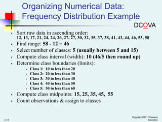
- 18. Organizing Numerical Data: Frequency Distribution Example DCOVA Sort raw data in ascending order: 12, 13, 17, 21, 24, 24, 26, 27, 27, 30, 32, 35, 37, 38, 41, 43, 44, 46, 53, 58 Find range: 58 - 12 = 46 Select number of classes: 5 (usually between 5 and 15) Compute class interval (width): 10 (46/5 then round up) Determine class boundaries (limits): 2-18 Class 1: Class 2: Class 3: Class 4: Class 5: 10 to less than 20 20 to less than 30 30 to less than 40 40 to less than 50 50 to less than 60 Compute class midpoints: 15, 25, 35, 45, 55 Count observations & assign to classes Copyright ©2011 Pearson Education
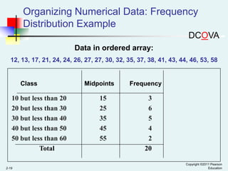
- 19. Organizing Numerical Data: Frequency Distribution Example DCOVA Data in ordered array: 12, 13, 17, 21, 24, 24, 26, 27, 27, 30, 32, 35, 37, 38, 41, 43, 44, 46, 53, 58 Class 10 but less than 20 20 but less than 30 30 but less than 40 40 but less than 50 50 but less than 60 Total 2-19 Midpoints 15 25 35 45 55 Frequency 3 6 5 4 2 20 Copyright ©2011 Pearson Education
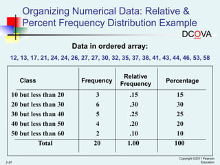
- 20. Organizing Numerical Data: Relative & Percent Frequency Distribution Example DCOVA Data in ordered array: 12, 13, 17, 21, 24, 24, 26, 27, 27, 30, 32, 35, 37, 38, 41, 43, 44, 46, 53, 58 Class 10 but less than 20 20 but less than 30 30 but less than 40 40 but less than 50 50 but less than 60 Total 2-20 Frequency 3 6 5 4 2 20 Relative Frequency .15 .30 .25 .20 .10 1.00 Percentage 15 30 25 20 10 100 Copyright ©2011 Pearson Education
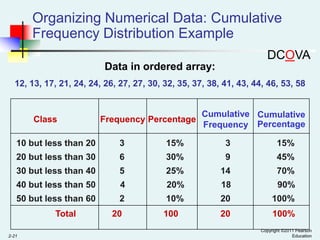
- 21. Organizing Numerical Data: Cumulative Frequency Distribution Example DCOVA Data in ordered array: 12, 13, 17, 21, 24, 24, 26, 27, 27, 30, 32, 35, 37, 38, 41, 43, 44, 46, 53, 58 Class Frequency Percentage Cumulative Cumulative Frequency Percentage 10 but less than 20 3 15% 3 15% 20 but less than 30 6 30% 9 45% 30 but less than 40 5 25% 14 70% 40 but less than 50 4 20% 18 90% 50 but less than 60 2 10% 20 100% 100 20 100% Total 2-21 20 Copyright ©2011 Pearson Education
- 22. Why Use a Frequency Distribution? DCOVA It allows for a quick visual interpretation of the data 2-22 It condenses the raw data into a more useful form It enables the determination of the major characteristics of the data set including where the data are concentrated / clustered Copyright ©2011 Pearson Education
- 23. Frequency Distributions: Some Tips DCOVA Shifts in data concentration may show up when different class boundaries are chosen As the size of the data set increases, the impact of alterations in the selection of class boundaries is greatly reduced 2-23 Different class boundaries may provide different pictures for the same data (especially for smaller data sets) When comparing two or more groups with different sample sizes, you must use either a relative frequency or a percentage distribution Copyright ©2011 Pearson Education
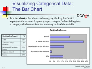
- 24. Visualizing Categorical Data: The Bar Chart DCOVA In a bar chart, a bar shows each category, the length of which represents the amount, frequency or percentage of values falling into a category which come from the summary table of the variable. Banking Preference Banking Preference? ATM Automated or live telephone % Internet 16% 2% Drive-through service at branch 17% In person at branch 41% Internet In person at branch Drive-through service at branch 24% Automated or live telephone ATM 0% 2-24 5% 10% 15% 20% 25% 30% 35% 40% 45% Copyright ©2011 Pearson Education
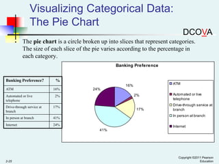
- 25. Visualizing Categorical Data: The Pie Chart DCOVA The pie chart is a circle broken up into slices that represent categories. The size of each slice of the pie varies according to the percentage in each category. Banking Preference Banking Preference? % ATM 16% ATM Automated or live telephone 16% 24% 2% 2% Drive-through service at branch 17% In person at branch 41% Internet 24% 17% Automated or live telephone Drive-through service at branch In person at branch Internet 41% 2-25 Copyright ©2011 Pearson Education
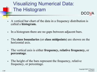
- 26. Visualizing Numerical Data: The Histogram DCOVA In a histogram there are no gaps between adjacent bars. The class boundaries (or class midpoints) are shown on the horizontal axis. The vertical axis is either frequency, relative frequency, or percentage. 2-26 A vertical bar chart of the data in a frequency distribution is called a histogram. The height of the bars represent the frequency, relative frequency, or percentage. Copyright ©2011 Pearson Education
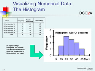
- 27. Visualizing Numerical Data: The Histogram 10 but less than 20 20 but less than 30 30 but less than 40 40 but less than 50 50 but less than 60 Total Frequency 3 6 5 4 2 20 (In a percentage histogram the vertical axis would be defined to show the percentage of observations per class) Relative Frequency .15 .30 .25 .20 .10 1.00 Percentage 15 30 25 20 10 100 8 Histogram: Age Of Students Frequency Class DCOVA 6 4 2 0 5 2-27 15 25 35 45 55 More Copyright ©2011 Pearson Education
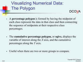
- 28. Visualizing Numerical Data: The Polygon DCOVA The cumulative percentage polygon, or ogive, displays the variable of interest along the X axis, and the cumulative percentages along the Y axis. 2-28 A percentage polygon is formed by having the midpoint of each class represent the data in that class and then connecting the sequence of midpoints at their respective class percentages. Useful when there are two or more groups to compare. Copyright ©2011 Pearson Education
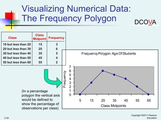
- 29. Visualizing Numerical Data: The Frequency Polygon Class Midpoint Frequency Class 15 25 35 45 55 3 6 5 4 2 Frequency Polygon: Age Of Students Frequency 10 but less than 20 20 but less than 30 30 but less than 40 40 but less than 50 50 but less than 60 (In a percentage polygon the vertical axis would be defined to show the percentage of observations per class) 2-29 DCOVA 7 6 5 4 3 2 1 0 5 15 25 35 45 55 65 Class Midpoints Copyright ©2011 Pearson Education
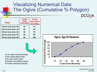
- 30. Visualizing Numerical Data: The Ogive (Cumulative % Polygon) DCOVA 10 but less than 20 20 but less than 30 30 but less than 40 40 but less than 50 50 but less than 60 10 20 30 40 50 (In an ogive the percentage of the observations less than each lower class boundary are plotted versus the lower class boundaries. 2-30 15 45 70 90 100 Ogive: Age Of Students Cumulative Percentage Class Lower % less class than lower boundary boundary 100 80 60 40 20 0 10 20 30 40 50 60 Lower Class Boundary Copyright ©2011 Pearson Education
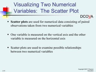
- 31. Visualizing Two Numerical Variables: The Scatter Plot DCOVA Scatter plots are used for numerical data consisting of paired observations taken from two numerical variables One variable is measured on the vertical axis and the other variable is measured on the horizontal axis Scatter plots are used to examine possible relationships between two numerical variables 2-31 Copyright ©2011 Pearson Education
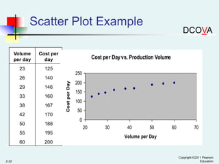
- 32. Scatter Plot Example Volume per day Cost per day 23 125 146 33 160 250 140 29 Cost per Day vs. Production Volume 38 167 42 170 50 188 55 195 60 Cost per Day 26 2-32 DCOVA 200 150 100 200 50 0 20 30 40 50 60 70 Volume per Day Copyright ©2011 Pearson Education